
Master Lightroom’s Tone Controls to Perfect Exposure, Contrast, and Balance
Learn how to Unlock Light, Depth and Mood in your Photos
When it comes to transforming a good photo into a stunning image, Lightroom’s Tone controls in the Basic panel are among the most powerful — and deceptively simple — tools available to photographers. The five essential sliders — Exposure, Highlights, Shadows, Whites, and Blacks — allow you to shape light, depth, and mood, giving your images a professional, polished look.
In this guide, you’ll discover exactly what each slider does, how they interact with your image histogram, and how to use them both correctively and creatively. Whether you want to recover detail in bright skies, enhance shadows without losing texture, or add contrast and depth naturally, these practical Lightroom techniques will help you achieve balanced, impactful photos. By the end, you’ll understand how to use Tone controls intentionally to elevate your photography and create images with depth, richness, and visual impact.
What you’ll learn
In this comprehensive Lightroom editing guide, you’ll learn how to:
Find and use the core Tone controls in Lightroom’s Basic panel
Read the histogram to evaluate exposure and tonal balance
Adjust Exposure, Whites, Blacks, Highlights, and Shadows with confidence
Correct common problems such as underexposed or overexposed images
Apply creative tonal adjustments to achieve styles like low key, high key, or natural looks
Avoid common editing mistakes that reduce image quality
Introducing the Basic Panel in Lightroom
The Basic panel in Lightroom is the starting point for most image adjustments, offering essential tools to control overall exposure, contrast, colour, and tonal balance. It’s divided into sections:
White Balance (WB): Lets you adjust the colour temperature and tint.
Tone: Lets you fine-tune brightness (Exposure), recover or enhance bright and dark areas (Highlights and Shadows), and set the pure white and pure black points (Whites and Blacks) to define your tonal range. It also lets you change the Contrast of an image.
Presence: Lets you adjust Texture, Clarity, and Dehaze to shape the image’s detail and depth. It also lets you adjust the Vibrance and Saturation of an image.
Together, these tools form the foundation of a Lightroom workflow, enabling you to correct exposure issues, enhance mood, and create a balanced, polished image before moving on to more targeted edits.
The five Tone controls – Exposure, Highlights, Shadows, Whites, and Blacks – are the subject of this article.
Note: This article equally applies to Lightroom, Lightroom Classic, as well as Adobe Camera Raw (ACR) which is the Lightroom plug-in for Photoshop.
The Histogram
Before we delve into the ins-and-outs of these Tone controls, I’ll briefly explain the histogram that I will use below to explain the effects of the various controls. Feel free to skip this section if you’re familiar with the histogram in Lightroom.
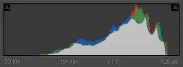
The Histogram provides a graphical representation of the tonal distribution of an image and helps you assess the exposure of a photo.
Here's a brief overview:
Horizontal Axis (X-axis): Represents the tonal range, from dark (left) to light (right).
Vertical Axis (Y-axis): Represents the number of pixels at each brightness level.
In a typical histogram:
Left Side: Represents the shadows or dark areas of the image.
Middle Section: Corresponds to the mid-tones.
Right Side: Represents the highlights or bright areas of the image.
Lightroom’s histogram has two warning triangles on the top:
Top Left: A lit triangle indicates clipping, and you may not be able to recover all shadow details. Hovering over this triangle will indicate the parts of the image that are clipped in blue.
Top Right: A lit triangle indicates clipping, and you may not be able to recover all highlight details. Hovering over this triangle will show the parts of the image that are clipped in red.
Note: You can permanently turn on these indicators (and turning them off again) by clicking the triangles.
“When you understand the histogram, you gain the confidence to shape your images with intention rather than guesswork.”
The Tone Controls Explained
Lightroom’s five Tone controls — Exposure, Highlights, Shadows, Whites, and Blacks — give you the tools to fine-tune the tonal range of your image: from the deepest shadows through the midtones, all the way up to the brightest highlights. Each control, shown as a slider in Lightroom, influences a defined region of the histogram, enabling you to shape brightness and contrast with precision.
Dragging a slider to the left darkens tones in its range, shifting data toward the shadow side of the histogram. Dragging it to the right brightens tones, pushing data toward the highlight side. The Blacks and Shadows sliders primarily target the darker end of the tonal scale, while Whites and Highlights shape the brighter end. Exposure acts more globally, with its strongest effect on the midtones but still influencing the entire tonal range.
In addition to the Basic panel, these sliders are also available in the Tone section when applying masks.
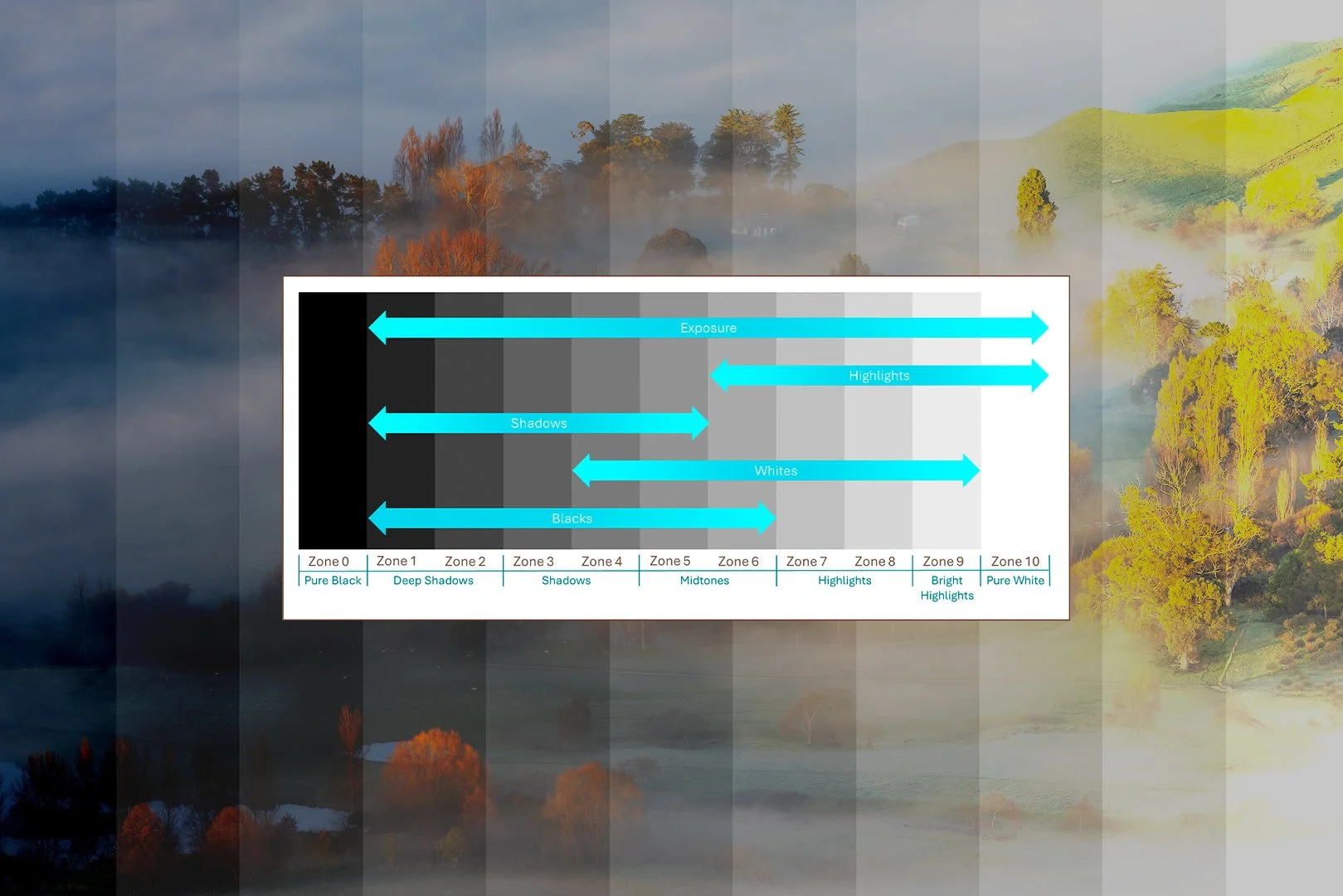
The greyscale test image below, divided into 11 zones based on Ansel Adams’ Zone System, illustrates the effective range of each control. The effective range of the Lightroom Tone sliders are illustrated in blue on the image, while the bottom of the image groups the zones by commonly used names that I will refer to in the detail below. Note that each slider has its greatest impact in the middle of its range, with influence tapering off toward the edges.
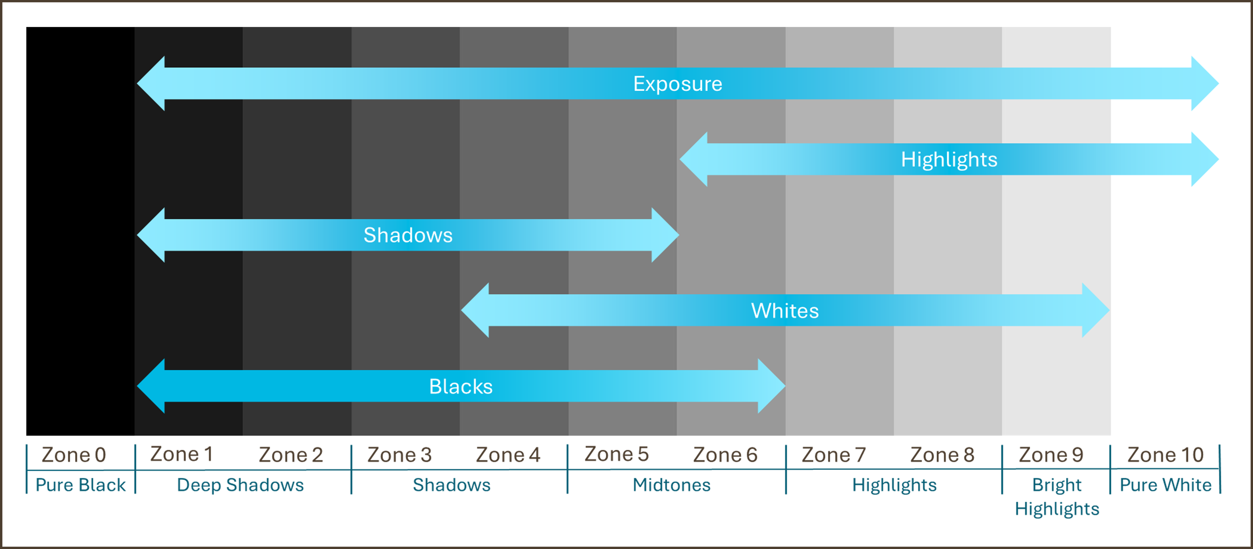
It’s worth noting that Lightroom’s implementation differs from what you’d expect based on its Histogram or Curves tool. In particular, you might assume that the Whites and Blacks sliders affect only the extreme ends of the histogram, while Highlights and Shadows work closer to the midtones. In practice, that’s not quite the case — as I’ll explain in more detail below.
Exposure
The Exposure control shifts the histogram left (darker) or right (brighter), with greater impact on mid zones and less at the extreme ends. The histogram compresses as it is moved towards the edge, protecting blacks and whites from clipping until pushed too far.
When to use: Best used to establish your base exposure after import. Keep adjustments moderate — extreme changes can lead to muddy shadows or clipped highlights. Use the slider to correct underexposed or overexposed shots, or to fine-tune images if you’ve applied the Expose to the Right (ETTR) technique (see my ETTR article here). As a rule of thumb, if my image is off by about one stop, I’ll adjust Exposure by that same amount. From there, I rely on the other tone controls to refine and balance the exposure further.
Interesting: At +5, pure blacks (zone 0) remain anchored, while at –5, pure whites (zone 10) reduce so much they will look flat or grey.
Highlights
The Highlights control targets the brighter areas of the image, with minimal impact on the midtones and shadows.
When to use: Excellent for recovering detail in bright skies or controlling glare on shiny surfaces. A subtle move left often restores highlight detail without affecting the rest of the image. A common use of this slider in landscape images is to restore highlight detail in the sky.
Interesting: Apart from the Exposure slider, the Highlights slider is the only Tone control that enables you to affect the pure whites (zone 10). But watch out: if you reduce the highlights too much, they will look flat or grey.
Shadows
The Shadows control targets the darker areas of the image, with minor impact on the midtones and minimal impact on the highlights.
When to use: Ideal for bringing out detail in the shadows without increasing the overall brightness of the image or deepening the shadows by dragging it left for mood and contrast.
Tip: Lifting shadows too much can reveal noise, especially in underexposed images — watch for grain and colour shifts.
Whites
The Whites control targets the midtones and brighter tones of an image, with minimal impact on the shadows.
When to use: Ideal for increasing the overall brightness of the image while leaving the shadows mostly untouched, thus creating more contrast. It enables you to set the white point, which is the brightest tone in an image that still contains detail, by expanding the histogram towards pure white. A properly set white point brings brightness and openness to an image, but pushing it too far will clip highlights and erase detail. Often, dragging the Whites and Highlights sliders to the left can restore the details of a bright sky.
Pro Tip: Hold Alt/Option when dragging Whites to instantly see clipping.
Interesting: Moving the slider towards the right (i.e. brightening the image) has a much greater impact than moving it towards the left (i.e. darkening the image). The Whites slider has a much wider range than the Highlights slider and has a much stronger overall effect on the bright areas of the image, while the Highlights slider is specifically targeting the bright highlights (zone 9).
I have found that I often use the Whites and Highlights sliders to adjust the white point. A common method I use is to dial down the Highlights while increasing the Whites. This seems to bring out the most highlight detail.
Blacks
The Blacks control targets the midtones and darker areas of the image, with minimal impact on the highlights.
When to use: Ideal for reducing the overall brightness of the image while leaving the highlights mostly untouched, thus creating more contrast. It enables you to set the black point, which is the darkest area in the image that still contains detail, by expanding the histogram towards pure black. A well-set black point adds depth and punch; too much and shadows lose all detail.
Pro Tip: Hold Alt/Option when dragging Blacks to instantly see clipping.
Interesting: None of the Tone controls in Lightroom enable you to remove pure black tones. If you have pure black in your image (which is unlikely if you have a well-exposed image of a landscape) you will need to use another tool, like the Curves tool to adjust this.
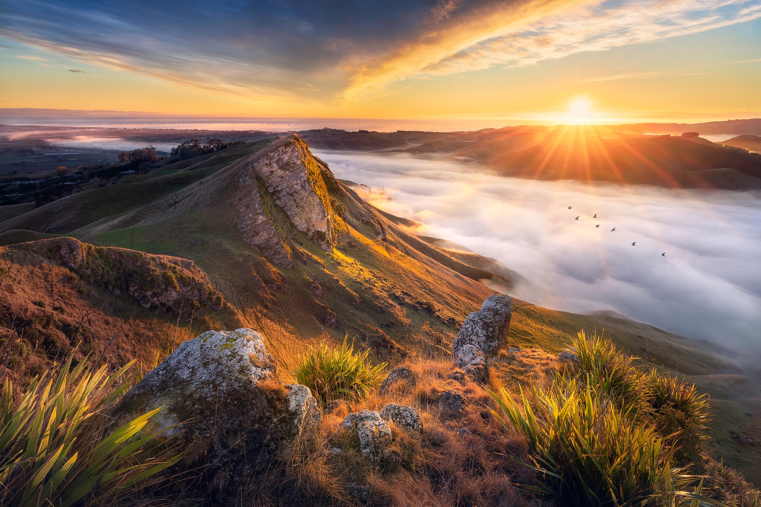
“Capturing a sunrise isn’t just about showing up early — it takes effort both in the field and in post-processing to preserve every tone and translate the moment into an image that truly engages.”
Common Exposure Challenges
Below follow a series of tonal adjustment techniques to correct specific, common exposure scenarios.
I will use scenes of Hawke’s Bay that I frequently visit with my workshop attendees to illustrate the challenges and corrections.
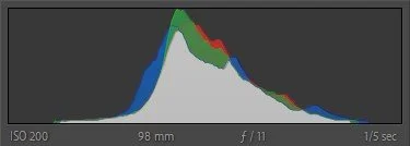
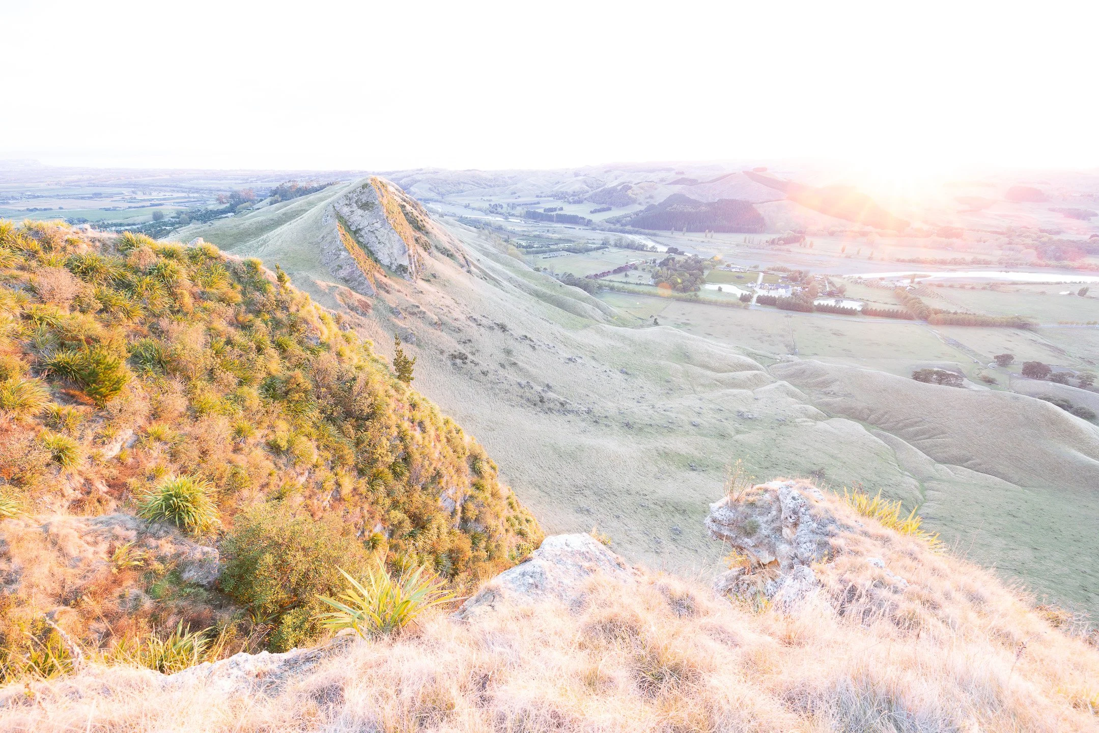
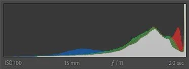
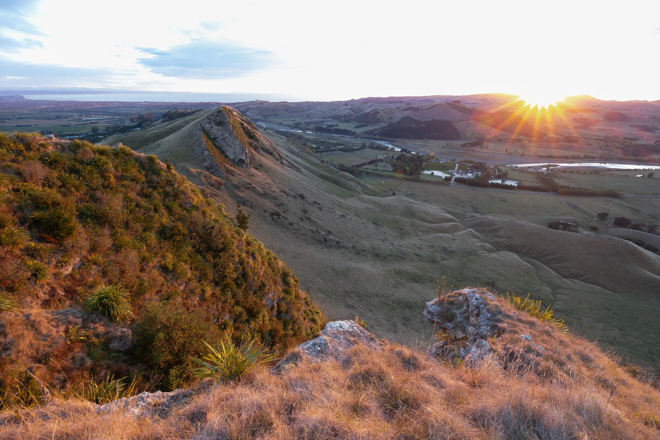
Well-Exposed Image
A histogram with a peak in the middle that gradually tapers off toward both ends indicates a well-exposed image. This usually suggests a scene with moderate contrast, where detail is preserved in both shadows and highlights.
Tonal adjustments:
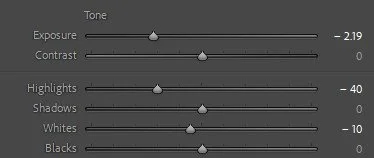
Use the Whites and Blacks to set tonal anchors and enhance contrast.
Use the Highlights and Shadows to recover detail if necessary.
Adjust Exposure for overall brightness, if needed.
Note: Adjusting these sliders is often an iterative process. As you drag one slider, you may find that you need to tweak another slider to compensate.

Original, as-shot image
Histogram of original image
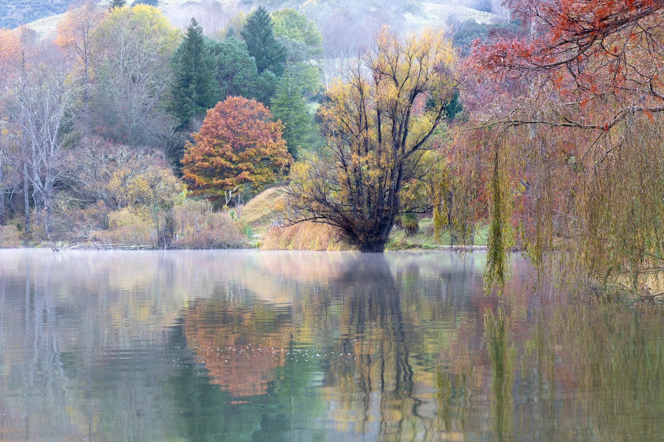
Corrected image
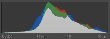
Histogram of corrected image

Tone Settings of corrected image
These subtle tonal adjustments show how a seemingly dull autumn scene at Lake Tūtira can be brought to life — and this is before adding any saturation 😊.
Underexposed Image
A histogram skewed to the left suggests an overall dark image, often with a loss of shadow detail. Clipping of the darkest tones may have occurred.
Tonal adjustments:
Increase Exposure to brighten the overall image.
Fine-tune with the other Tone controls to recover detail and add contrast (see Well-Exposed Image).
Alternatively, increase the Blacks, Whites and Shadows instead of the Exposure, though the image may still appear dark depending on the level of underexposure.
If you captured exposure-bracketed shots for blending, adjusting the Exposure to match the tones of the bracketed sequence is usually the best approach.
Note: You may not be able to recover all shadow details and Lightroom may indicate clipping (blue highlight in the histogram warning triangle at the top left).

Original, as-shot, underexposed image

Histogram of original image
Corrected image

Histogram of corrected image
Tone Settings of corrected image
Pro Tip: Underexposing a sunrise (or sunset) is a good approach to retain highlight details.
Overexposed Image
A histogram skewed to the right suggests an overall bright image, with a risk of losing highlight detail. Clipping of the brightest tones may have occurred.
Tonal adjustments:
Decrease Exposure to reduce overall brightness.
Fine-tune with the other Tone controls to recover detail and add contrast (see Well-Exposed Image).
Alternatively, reduce Blacks, Whites, and even Shadows instead of Exposure, though the image may still appear too bright depending on the degree of overexposure.
As with underexposed images, if you bracketed exposures for blending, adjusting Exposure to align with the sequence is usually the best solution.
Note: You may not be able to recover all highlight details and Lightroom may indicate clipping (red highlight in the histogram warning triangle on the top right). In the example image below, the highlight detail in the sky could not be recovered (lowering the Whites and Highlights sliders just creates a grey area without any detail). Interestingly, Lightroom doesn’t show the warning triangle.
Original, as-shot, overexposed image
Histogram of original image
Almost Corrected image

Histogram of the almost corrected image
Tone Settings of the (not quite) corrected image
Pro Tip: Overexposing an image is a good way to capture shadow detail in a high contrast scene. However, if your image contains a bright sky (or anything else bright like snow or a sandy beach), the highlights are often impossible to recover.
High Contrast Image
A histogram with most data concentrated at the far left (shadows) and far right (highlights), with little in the middle (midtones), indicates a high-contrast scene. This suggests a wide dynamic range, where clipping in both the shadows and highlights may have occurred.
This is often the most challenging type of image to balance.
Tonal adjustments:
Lower the Whites and Highlights to reduce brightness and spread pixel data toward the midtones.
Raise the Blacks and Shadows to lift the dark areas and push more data toward the midtones.
Use the Exposure to adjust overall brightness if needed.
Note: Some detail in the shadows or highlights may be unrecoverable, and Lightroom may indicate clipping in both (triangles on the top of the histogram). In such cases, using exposure bracketing (see my article here) when capturing the scene is the only way to preserve the full tonal range.
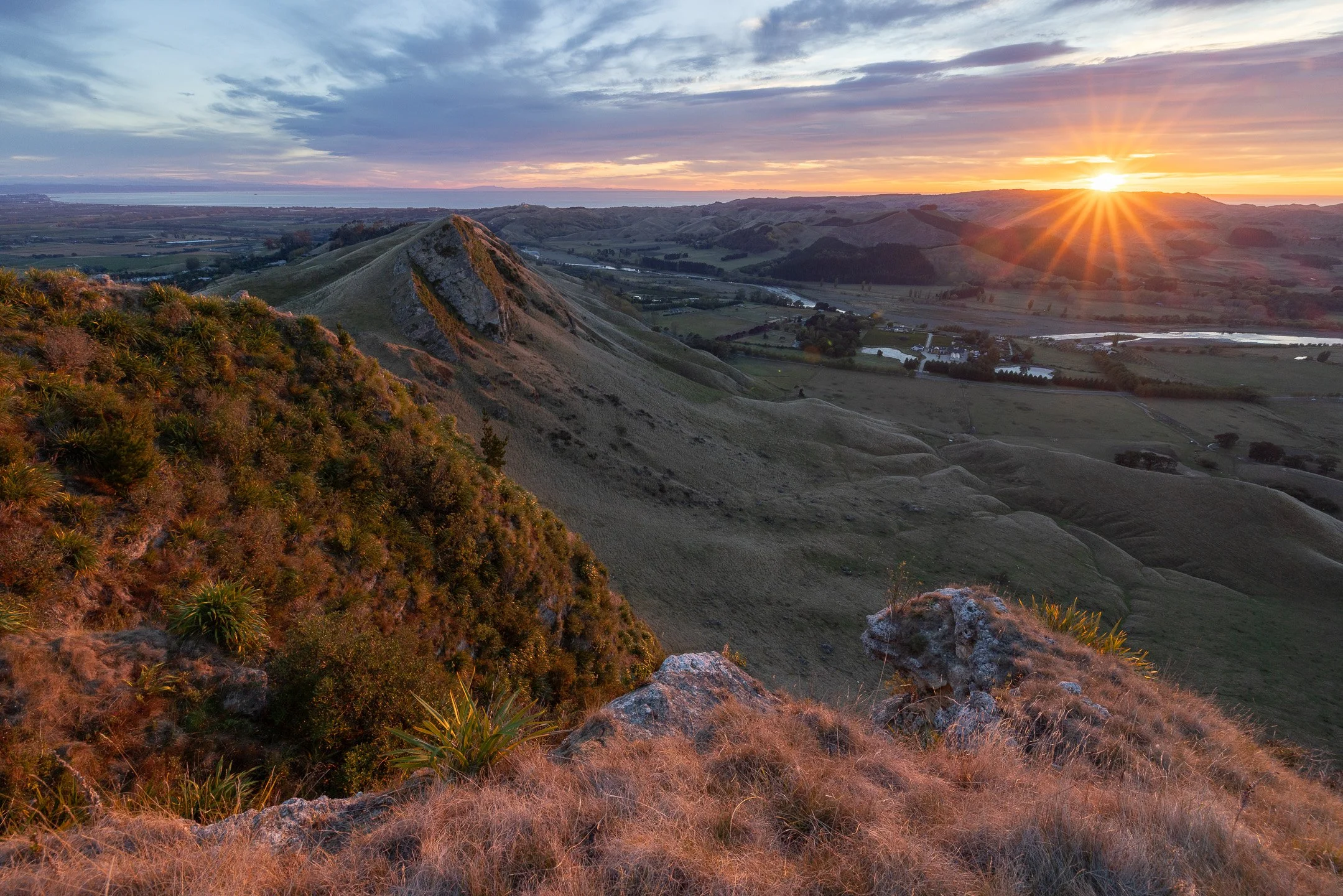
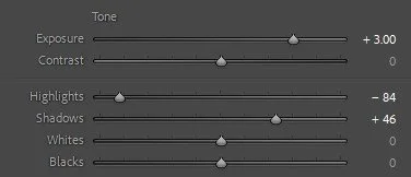
Original, as-shot, high-contrast image

Histogram of the as-shot image
Corrected image

Histogram of the corrected image

Tone Settings of the corrected image
Sunrises often create high-contrast scenes — Lightroom’s tone controls help bring balance back.
“Every photographer’s style begins with one thing: mastering tone controls.”
Creative Use of the Tone Controls
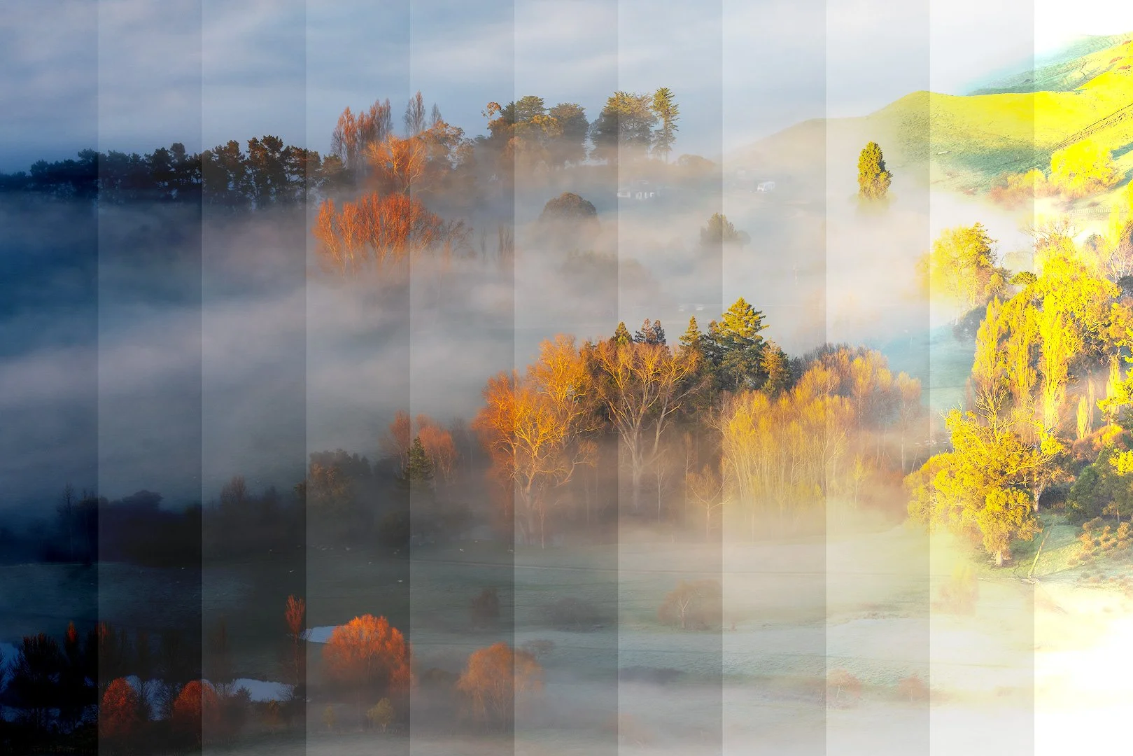
Beyond correcting exposure issues, Lightroom’s Tone controls can also be used to craft deliberate artistic styles. By adjusting how tones are distributed across the histogram, you can shift the mood and atmosphere of an image — from the dramatic darkness of low key, to the luminous brightness of high key, to the bold punch of contrasty styles, or the muted subtlety of flat renderings. These approaches are less about technical “accuracy” and more about creative expression, using tone to evoke feeling and shape the viewer’s response. All tonal adjustments described below assume that you start with a well-exposed image as a base.
Note: All tonal adjustments described below assume that you start with a well-exposed image as a base.
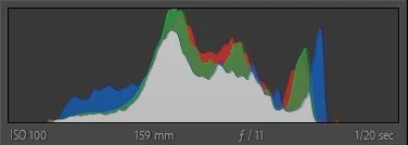
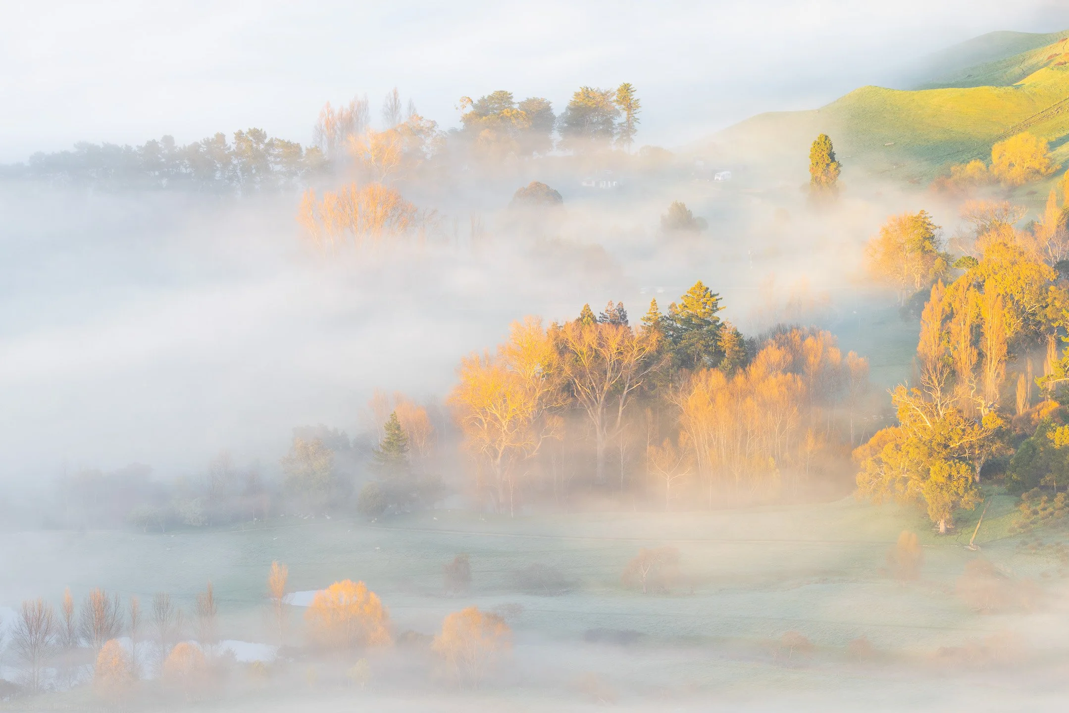
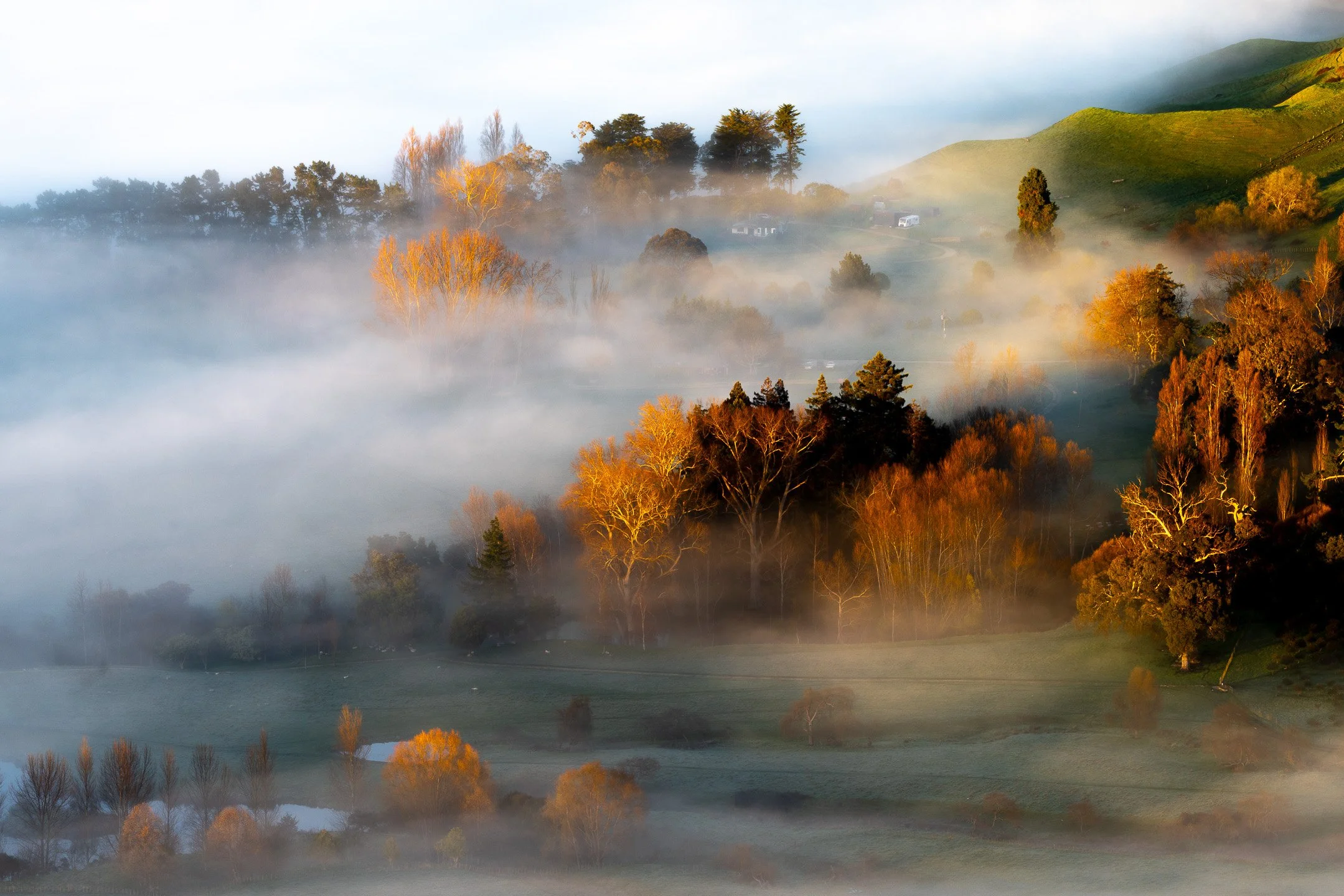
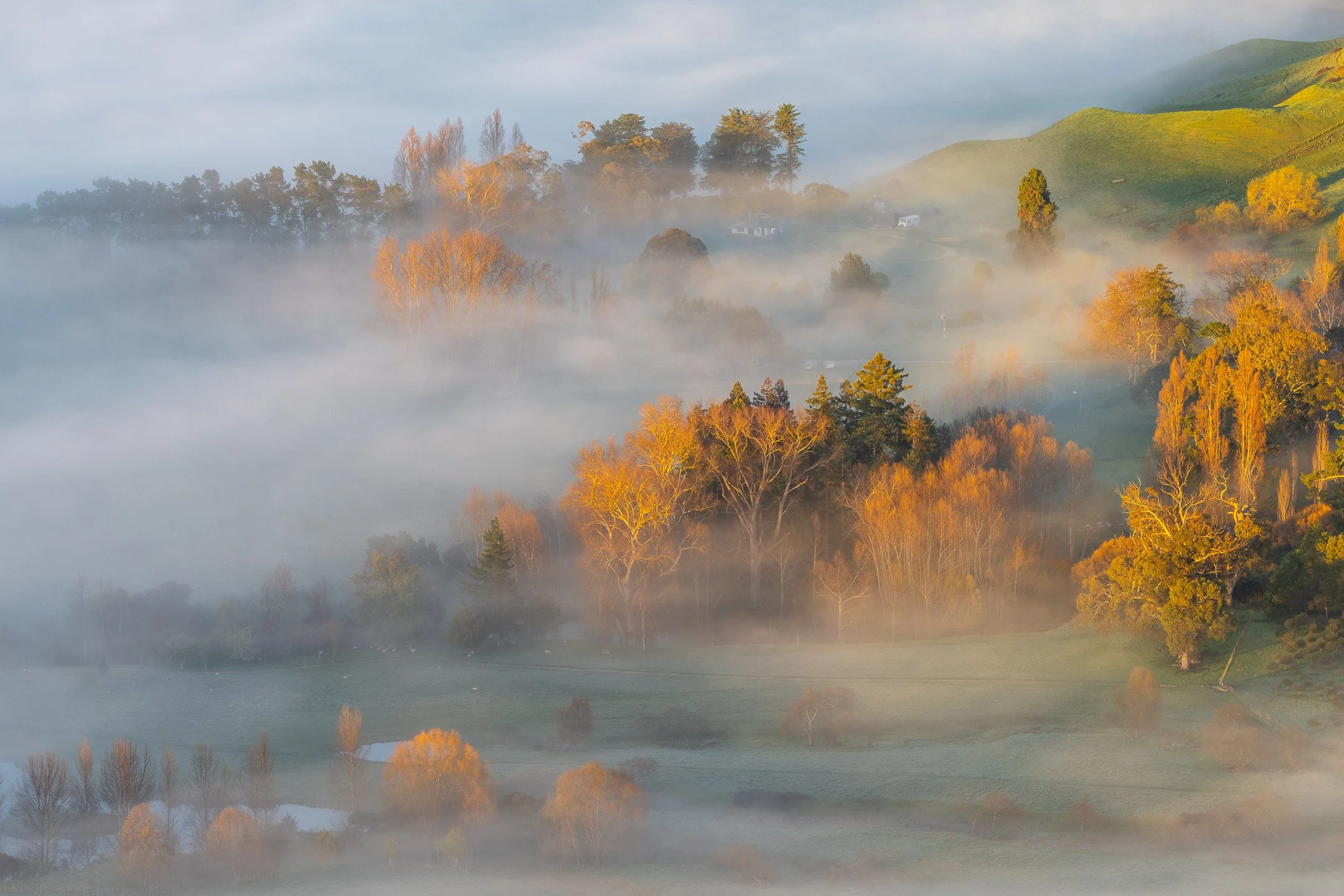
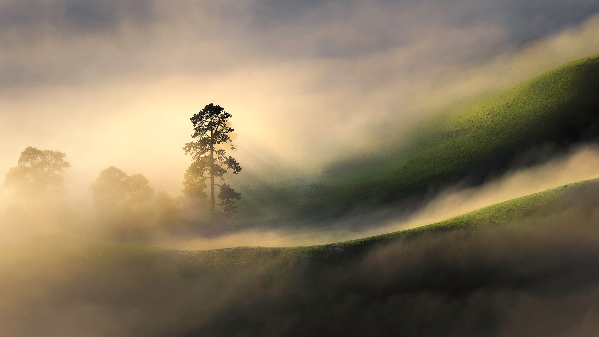
I’ll use the following image of a misty scene in Hawke’s Bay (New Zealand) to demonstrate the tonal adjustments for the various styles.

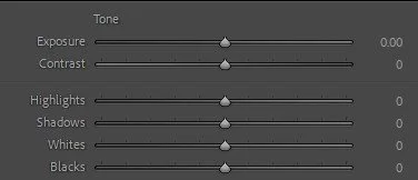
Original, as-shot Image with the corresponding histogram and tone control settings
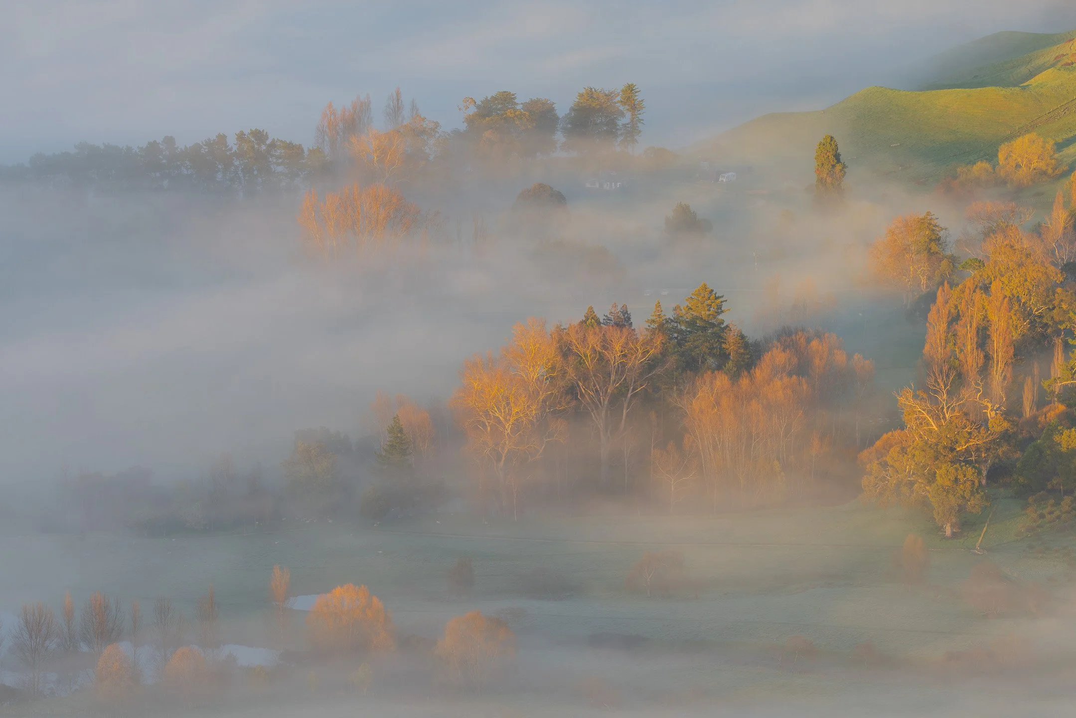
Low Key Style
An intentionally underexposed image is a characteristic of a low key style: most tones fall in the shadows and darker midtones, creating mood, drama, and atmosphere. Some loss of detail in the deepest blacks is common, and minor clipping of the darkest tones may occur, but this is often part of the aesthetic rather than a flaw.
Tonal adjustments:
Lower the Exposure to create a dark image.
Raise the Whites to restore highlights where needed.
Adjust the Highlights, Blacks and Shadows to suit.
Pro Tip: Use masking to highlight some details, such as sunlight on a tree.

Low key style image with corresponding tone control settings
High Key Style
An intentionally overexposed image is a characteristic of a high key style: most tones fall in the highlights and lighter midtones, creating an airy, luminous, and uplifting feel. Some loss of detail in the brightest whites is common, and minor clipping of the highlights may occur, but this is often embraced as part of the aesthetic rather than a flaw.
Tonal adjustments:
Raise the Exposure to brighten the overall image.
Raise the Blacks and Shadows to reduce shadows
Lower the Whites and Highlights to manage highlight detail.
Pro Tip: In order to lighten deep blacks, Curves can be used to adjust the blacks further than what can be achieved using the tonal controls in the Basic Panel.

High key style image with corresponding tone control settings
Contrasty Style
A histogram stretched toward both ends indicates a wide tonal distribution, characteristic of a contrasty style. Unlike accidental over- or underexposure, this approach is intentional: most tones cluster in the deep shadows and bright highlights, with fewer midtones, creating a bold, dramatic, and high-impact look. Some loss of detail in both the darkest blacks and brightest whites is common, and minor clipping at either end may occur, but this is often embraced as part of the aesthetic rather than a flaw.
Tonal adjustments:
Increase the Whites to increase brightness.
Reduce the Blacks and Shadows to increase contrast.
Adjust the other controls to suit.
Pro Tip: This style often benefits from added Contrast and Clarity to separate tones even further. It is frequently applied to monochromatic images to emphasise patterns and textures.
Contrasty style image with corresponding tone control settings
Flat (or Low Contrast) Style
A histogram bunched toward the centre indicates a narrow tonal distribution, characteristic of a flat or low-contrast style. Unlike simple underexposure or overexposure, this is intentional: most tones fall within the midtones, with fewer deep shadows or bright highlights, creating a soft, muted, and understated look. Some loss of punch and separation between tones is common, and the absence of extremes in blacks and whites may occur, but this is often embraced as part of the aesthetic rather than a flaw.
Tonal adjustments:
Lower the Whites and Highlights to reduce brightness.
Raise the Blacks and Shadows to soften contrast.
Pro Tip: This type of image is often paired with reduced Contrast and Vibrance/Saturation producing the gentle, muted look not unlike an unprocessed RAW file.

Flat, low contrast style image with corresponding tone control settings
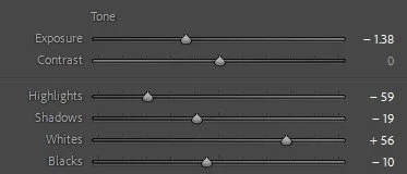
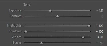
Natural Style
A histogram spread evenly across the range without heavy clustering at either end indicates a balanced tonal distribution, characteristic of a natural, somewhat airy style. Unlike high-contrast or flat approaches, this is intentional: tones are well represented from shadows through midtones to highlights, creating a light, open, and true-to-life look. Some subtle clipping may occur at the brightest whites or deepest blacks, but overall detail is preserved, giving the image a clean, spacious, and uplifting feel that enhances the sense of atmosphere without overpowering it.
Tonal adjustments:
Increase the Whites to add brightness.
Decrease the Highlights to preserve highlight detail.
Raise the Shadows to open up darker areas.
Lower the Blacks slightly to maintain contrast.
Pro Tip: Create a stronger sense of depth by adding a touch of haze to the background with masking, while boosting clarity and contrast in the foreground to draw the viewer in.

Natural style image with corresponding tone control settings
“Global adjustments set the stage, but it’s local adjustments that bring the tones to life.”
Common Mistakes to Avoid When Making Tonal Adjustments in Lightroom
Even with powerful tools like Lightroom’s Tone controls, it’s easy to slip into habits that flatten your photos or create unnatural results. Here are some of the most common mistakes — and how to avoid them.
Relying Too Much on Global Adjustments
Many photographers try to fix everything with the global sliders in the Basic panel. For example, lowering Highlights or Whites to tame a bright sky will also pull detail and contrast out of lighter tones elsewhere in the image.
Better approach: Use global adjustments to establish your base exposure, then fine-tune using local adjustments (brushes, gradients, or Lightroom’s Subject/Sky masks). This allows you to target problem areas, such as skies, without sacrificing tonal quality in the rest of the frame.
Pro Tip: Lightroom’s AI-powered Sky and Subject masks make this faster and more accurate than ever.


From an as-shot image to a corrected image with global adjustments followed by local adjustments.
Ignoring the Clipping Warnings
Lightroom’s histogram includes two small triangles at the top — left for shadows, right for highlights. If they light up, you’re losing detail to pure black or pure white. Many photographers overlook these indicators, only to discover later that they’ve lost critical detail.
This can happen not only with tonal adjustments, but also when adjusting white balance, clarity, texture, or colour adjustments.
Best practice: Keep an eye on these clipping warnings as you edit. Hold down Alt/Option while dragging Whites or Blacks to see exactly where clipping starts. Use them as a guide, not an absolute rule — sometimes a little clipping is part of the style (e.g., high key or contrasty images).
Pro Tip: Always check the clipping warnings before exporting your images.
Blowing Out the Highlights
Scenes with extreme contrast, like sunrises or sunsets, often produce blown-out highlights that you can’t fully recover. While the sun itself is naturally bright, the area around the sun often turns into an unsightly white blob.
How to avoid or fix it:
Slightly underexpose in-camera to protect highlights, then lift shadows in Lightroom.
Use exposure bracketing for wide dynamic range scenes and blend the shots.
Pro Tip: If clipping is unavoidable, pull back the highlights slider to soften the blown-out edge and apply creative masking. For instance, using a Radial Gradient with negative Dehaze and a yellow colour could disguise a blown-out sun.
Introducing Noise in the Shadows
Noise doesn’t just come from high ISO; it also appears when trying to recover detail from deep shadows in underexposed images.
How to minimise it:
Expose properly in the field — don’t underexpose unnecessarily if the scene isn’t high-contrast.
Use exposure bracketing for dark scenes.
If shadows are already noisy, consider keeping them darker instead of over-lifting.
Pro Tip: Use Denoise in Lightroom (or a dedicated tool) to reduce visual noise in RAW photos, especially those taken at high ISO or in low light.
Creating Halos Around Edges
Halos — glowing outlines around subjects — are a tell-tale sign of heavy-handed adjustments. They often appear when masking skies, boosting clarity/sharpness, or pushing contrast along edges.
Strategies to avoid halos:
Use gradual masks (Linear/Radial Gradients) instead of hard-edged Sky/Subject masks when possible.
Avoid making extreme Exposure changes in a mask; instead, adjust Whites/Highlights for brightness.
If halos do appear, soften them by reducing local Clarity/Sharpness with a brush.
Pro Tip: Intersect a Sky mask with a Linear Gradient mask to gradually blend in the adjustments to avoid harsh tonal differences and create a natural, atmospheric perspective (it’s usually hazier in the distance).
Overusing Contrast and Clarity
Another mistake is cranking up Contrast or Clarity globally to “add punch.” While tempting, this often leads to crushed shadows, blown highlights, or a harsh, gritty look that ruins subtle tonal transitions.
Better approach: Add contrast selectively by balancing Whites, Blacks, Shadows, and Highlights, then use local Contrast/Clarity on the subject or key textures.
Shooting in JPEG mode
One of the most common mistakes beginners make is shooting in JPEG instead of RAW. JPEG files are compressed, which means a lot of tonal and colour information is discarded. This limits how much you can recover from shadows or highlights during post-processing, often leaving you stuck with blown-out skies or muddy dark areas.
How to fix it:
Always shoot in RAW whenever possible. RAW files retain the full range of tonal data captured by your camera’s sensor, giving you far greater flexibility to adjust exposure, recover detail, and fine-tune colours. Of course, the goal should always be to nail the exposure in-camera, but RAW gives you the safety net to make creative or corrective adjustments later.
Pro Tip: If you still want quick, shareable images straight out of the camera while keeping the flexibility of RAW, shoot in RAW+JPEG mode. This way you get the convenience of ready-to-use JPEGs alongside the full editing potential of RAW files.
Don’t be Afraid to use those Sliders
One of the biggest mistakes photographers make in Lightroom is holding back out of fear that they’re “over-editing.” Remember, working with a RAW file gives you a huge amount of flexibility — far more than a JPEG. Adjusting exposure, highlights, shadows, whites, and blacks isn’t cheating or “breaking the rules”; it’s about unlocking the full potential of the data your camera captured.
Don’t forget:
Your goal in editing is often to make the image look closer to how you actually experienced the scene — the depth in the shadows, the glow in the highlights, or the balance of light that your eyes naturally perceived. Subtle tonal adjustments can help you recover detail, add depth, and restore the atmosphere of the moment. Don’t be afraid to move the sliders with intention. Editing is part of the creative process, and when done thoughtfully, it enhances rather than diminishes the authenticity of your photograph.
Pro Tip: Stay true to your photographic vision. There’s no single “right” way to edit — every adjustment is a creative choice that reflects your style.
Forgetting to Step Back
It’s easy to get tunnel vision when developing your images, especially when fine-tuning sliders. Photographers often “overcook” an image without realising it.
How to avoid this:
Step away from your screen, view the photo smaller, or compare before/after regularly. Or, leave the image for a day, and look at it again the next day with fresh eyes. Sometimes less is more, and restraint preserves a natural, timeless look.
Pro Tip: After making major adjustments, check the smaller version of your photo in the Navigator panel. Viewing the image at a reduced size helps you spot overall tonal balance, contrast issues, or unnatural edits that might be less obvious when zoomed in.
“Editing is not about fixing a bad photo — it’s about unlocking the full potential of a good one.”
Conclusion
Mastering Lightroom’s Tone controls is less about memorising what each slider does and more about understanding how they interact to shape light, contrast, and mood. By starting with an as-shot image and then using Exposure, Highlights, Shadows, Whites, and Blacks with intention, you can correct common challenges like under- or overexposure, balance tricky high-contrast scenes, or push your images toward a creative style such as low key, high key, or natural. The key is subtlety and iteration: small, deliberate adjustments build on each other to produce depth and presence without sacrificing detail. Combine this with localised adjustments when needed (and you usually do), and you’ll have the flexibility to transform technically sound captures into photographs that communicate atmosphere, story, and emotion.
References
If you’d like to deepen your editing skills, here are some follow-on articles that build on what you’ve learned here:
Exposure Bracketing - a shooting technique for high-contrast scenes.
Exposure Stacking - a post-processing technique to blend bracketed shots.
Expose to the Right (ETTR) – a shooting technique that ensures maximum tonal data for post-processing.
JPEG vs RAW vs DNG - why you should shoot in RAW.
By combining these techniques with the fundamentals of the Tone controls, you’ll not only gain technical confidence but also develop your own editing style that brings out the best in every image.
Looking for Personalised Guidance?
Reading about technique is a great start — but the fastest way to really level up your photography is through hands-on learning.
If you’d like tailored guidance, join me for a private workshop in Hawke’s Bay or book an online processing session where we can dive into your images together.
Share this article
Enjoyed this article?
You can subscribe to my newsletter for more Lightroom tips, editing tutorials, and behind-the-scenes insights from my photography journey by filling in the form at the bottom of this page.
Other articles that you may find interesting
In this article, I provide some tips to not only enjoy, but also improve your chances of capturing great images in an unfamiliar landscape.