
Landscape Photography Composition: The Essentials
This guide covers composition from first principles through to the judgement calls that come with experience: the rule of thirds, leading lines, balance, negative space, framing, and how light and atmosphere shape a scene. Whether you're new to landscape photography or you've been at it a while and want to get more deliberate about your choices, it's built around the same questions I ask people on my own photography workshops.
Throughout this guide, examples lean towards one of two ends of a compositional spectrum: Structured Landscapes, like Mirrored Waters, where pattern and repetition are already doing the organising, and Atmospheric Landscapes, closer to Trees in Mist, where form is revealed through fog, reduction, and restraint rather than geometry. Neither is the better approach, they're simply two different conditions a scene can hand you, and you'll see both referenced throughout as a second lens alongside each technique.
In this guide:
Observation
Placing the Subject — Rule of Thirds, Horizon Line Placement, Symmetry & Reflection, Focus Point, Balance & Visual Weight, Point of View, Framing Orientation & Aspect Ratio
Guiding the Eye — Leading Lines, Curved Lines, Diagonals & Triangles, Tension
Working with Depth and Space — Layers, Scale, Natural Framing, Negative Space, Edge Awareness
Reading the Scene — Texture & Pattern, Light, Atmosphere, Tonal Contrast, Colour
Finishing the Image — Aperture, Shutter Speed, Focal Length, Post-Processing
Before You Press the Shutter
Where to Go From Here
Observation
Before You Compose
Before I talk about technique, I want to talk about looking. When I'm out with someone on a workshop, before we even discuss the camera, I'll ask a few simple questions: What are you drawn to here? What do you like about this scene? What do you want to show someone else about this place?
These aren't warm-up questions. They're the actual foundation the rest of composition sits on. That's what intent is, not a grand artistic statement, just an honest answer to why you're pointing the camera at this, and not at the dozen other things nearby.
A technique like the rule of thirds or leading lines only works once you know what you're using it for, and that only comes from paying attention first.
Watch what people often do first when they arrive somewhere: the tripod comes off the shoulder and goes straight down, usually at the first spot that looks roughly right. That's already a decision, a stake in the ground about where the frame will be, made before any of the looking has happened. Once it's down, there's a quiet pull to make that spot work rather than keep searching for the one that does.
So try this before you raise the camera at all. Notice what pulls your eye, and ask why. Look at where your attention lands first in the scene, and what's carrying that visual weight, whether it's light, colour, shape, or simply being the only still thing in a busy frame. Notice what feels like it belongs, and what feels like it's just there. Often, a scene gets stronger by removing something rather than adding it.
Once you've answered those for yourself, you're ready to start composing on purpose instead of by accident, which is what the rest of this guide is about.
Placing the Subject
Once you know what you're responding to, the next question is where to put it. That first part is intent; everything from here on is just carrying it out. These three ideas, the rule of thirds, a chosen focus point, and balance, are really different ways of answering the same thing: how do you arrange what you noticed so it holds together in the frame?
The Rule of Thirds: A Useful Beginning
If you've picked up a camera before, you've probably already heard of this one. Divide the frame into three equal sections, both across and down, and place what matters along one of those lines or where two of them cross. It's often the first compositional idea photographers come across, and for good reason.
The grid gives you somewhere to put things when a scene feels too open or too busy to know where to start.
Think of it less as a rule and more as training wheels. In a landscape with strong lines already in it, a ridge, a horizon, a row of trees, those lines will often want to sit close to a third anyway, and letting them settle there gives the image a rhythm that feels considered rather than accidental. In a quieter scene, a single tree or a break in the fog, the grid matters less than the space around it; a subject can sit dead centre and still feel balanced, if there's enough calm around it to hold it there.
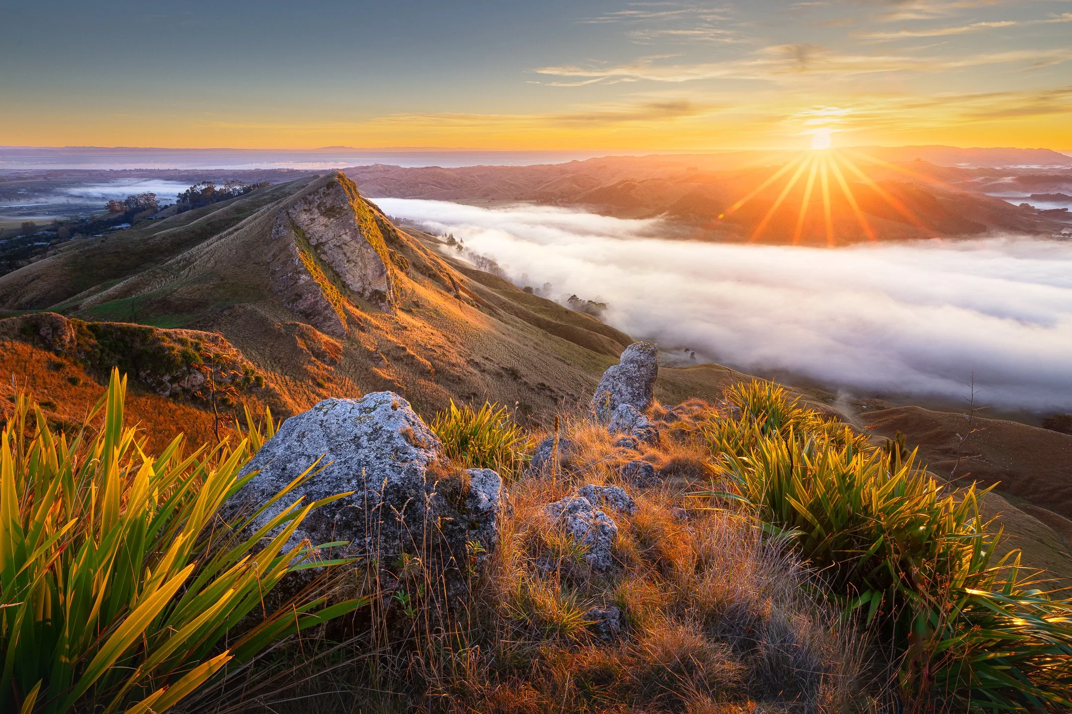
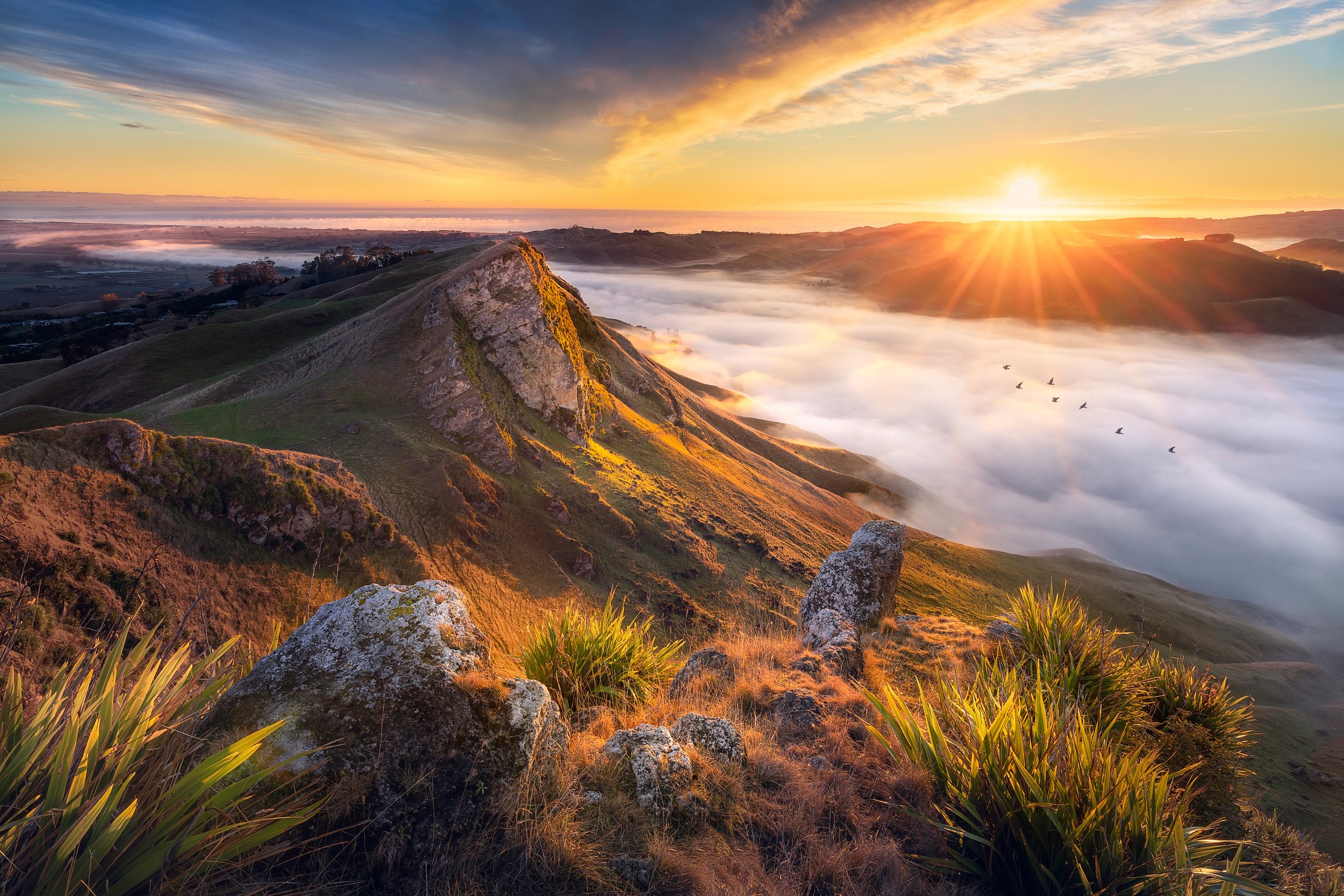
The horizon sits along the upper third, leaving most of the frame to the ridge and the fog pooling below it. The rocky outcrop in the foreground holds the lower third, its flax and grass catching the first light, while the sunburst lands close to where the upper and right lines cross. Nothing here is centred, and the image is stronger for it, each third doing its own quiet work to hold the scene together.
The grid is only ever a starting point though. Once you can see why an image along the thirds feels balanced, you'll also start noticing when breaking it works better, centring something for stillness, or pushing it right to the edge for tension. That instinct is really what this section is trying to build, not the grid itself.
Horizon Line Placement
One version of this question comes up constantly: where should the horizon sit? A high horizon, placed on the upper third, gives foreground detail room to dominate the frame, useful when the ground itself, tussock, rock, reflected water, is the more interesting part of the scene. A low horizon, placed on the lower third, hands most of the frame over to the sky, which suits a dramatic sunset or a sky doing something a flat foreground can't compete with.
There's rarely a wrong answer here, only a question of which half of the frame has more to say in this scene. What is worth avoiding, in almost every case, is splitting the frame exactly in half. A dead-centre horizon tends to leave both halves competing for attention rather than one clearly leading.
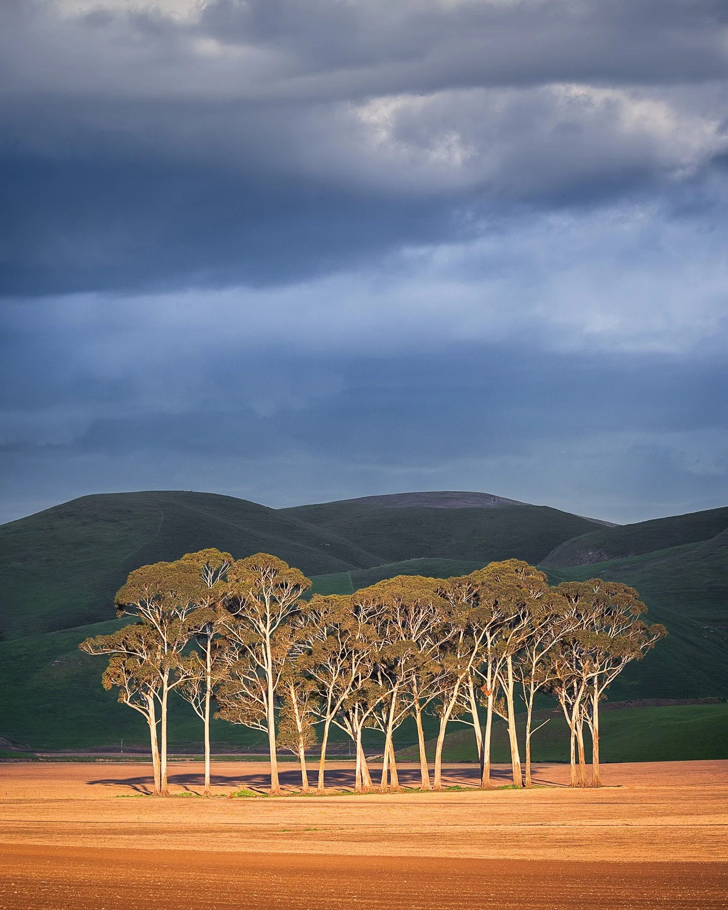
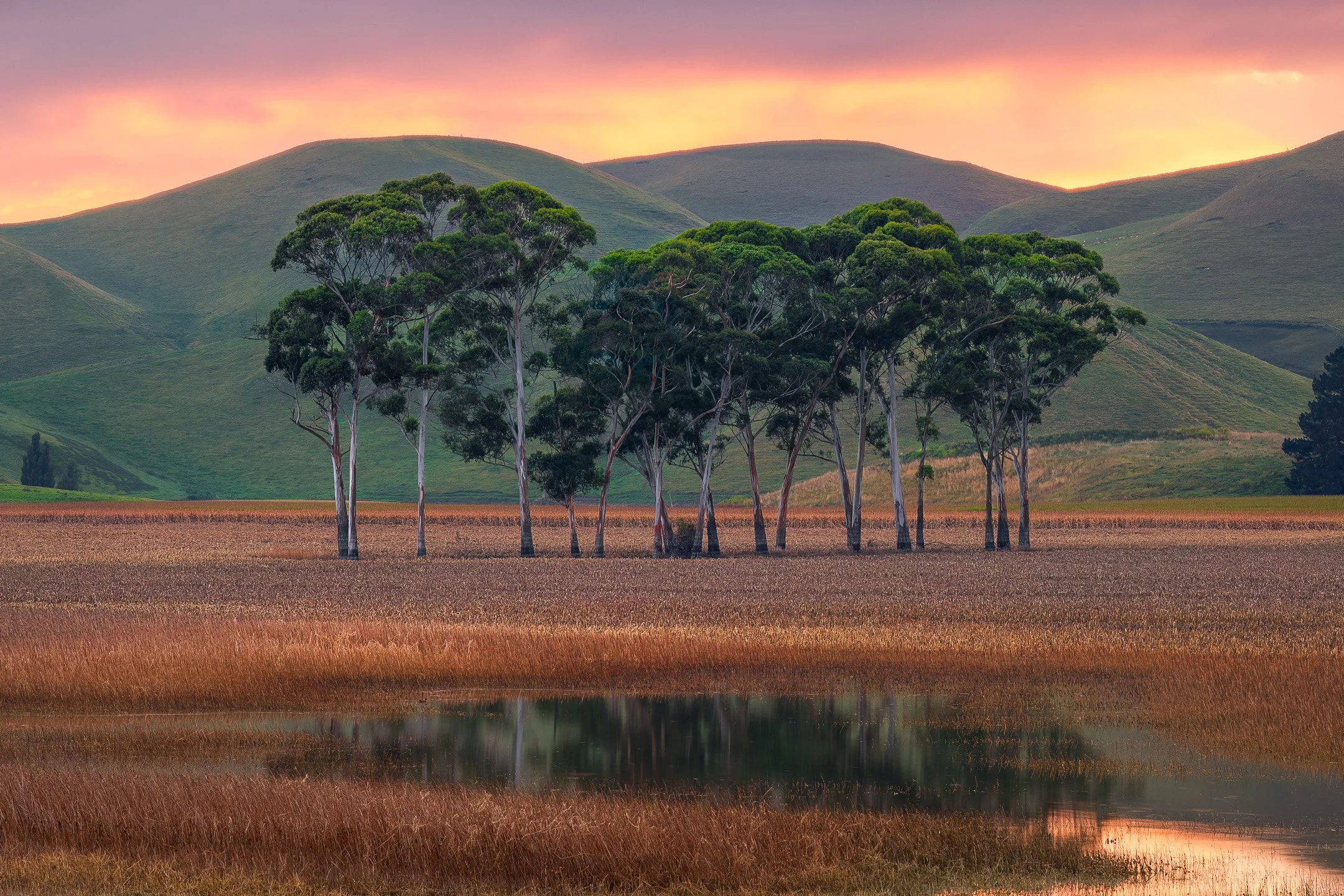
Photographing the same stand of trees with two different horizon line placements shows how framing dictates the story. The horizontal image places the ridgeline high to let the wetland reflection and ground detail dominate the scene, while the vertical frame drops the horizon into the lower third, allowing the dramatic sky to carry the mood.
Symmetry & Reflection
Some scenes offer a kind of order the rule of thirds doesn't really account for: two halves that mirror each other. When capturing still water reflecting a shoreline or a valley repeating on either side of a ridge, these compositions often work best centred rather than placed on a third, since the whole point is the mirroring itself, and centring it lets that mirroring read clearly.
A symmetrical composition holds its own kind of balance, one built on repetition rather than weighted placement.
It rewards a different kind of looking: less where do I place this, more how exactly do the two halves relate. A small break in the symmetry, a ripple disturbing a reflection, a single tree off to one side, often does more for the image than perfect mirroring alone, giving the eye something to catch on rather than simply confirming what it already saw on the other side.
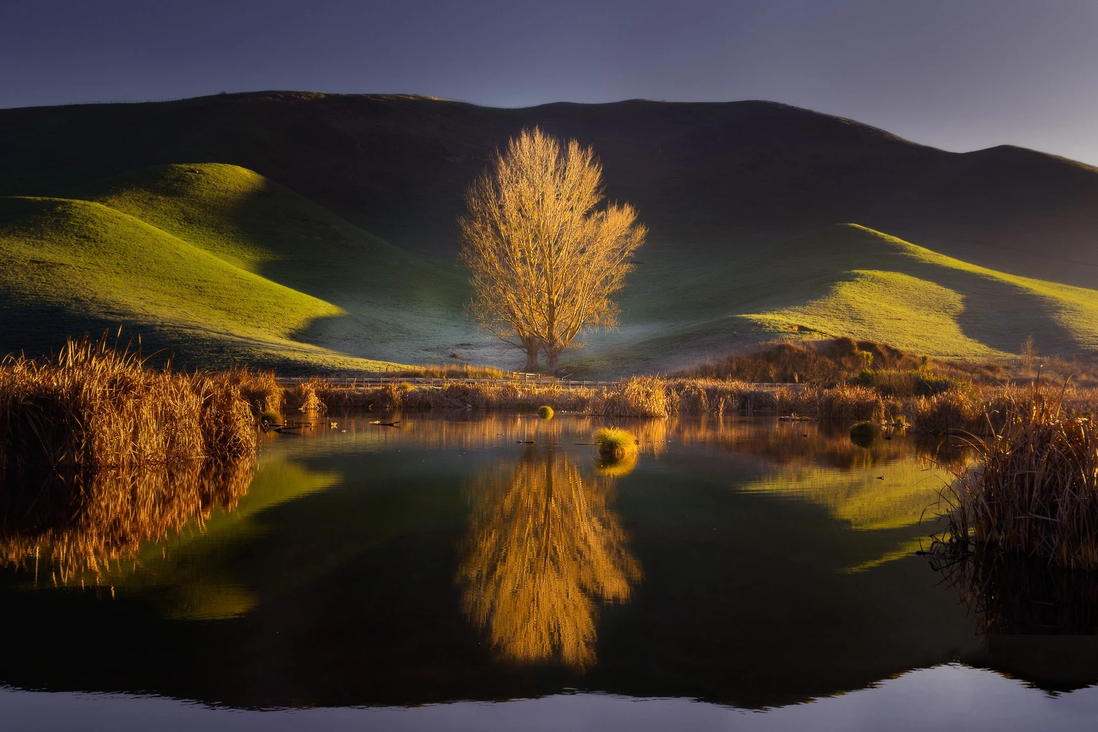
Still wetland water mirrors the glowing poplar in the centre of the frame. Placing the tree directly in the middle lets the reflection read clearly, using the vertical symmetry between land and water to hold the composition in quiet balance.
Focus Point: Anchoring the Image
Every scene has a place your eye lands first, whether you chose it or not. A focus point is just that place, made deliberate. It might be a solitary tree, a bright patch on the water, a shape holding a slightly darker tone than everything around it, but its job is always the same: to give the viewer somewhere to rest before they explore the rest of the frame.
In a landscape with strong structure already in it, that anchor often finds itself naturally on a line, a ridge, a repeating form, and placing it on a third or where two lines cross tends to feel right without much effort. In softer, quieter scenes, the anchor works differently. A lone shape emerging from fog doesn't need a grid to feel placed; it just needs enough space around it to hold the eye gently rather than pin it down.
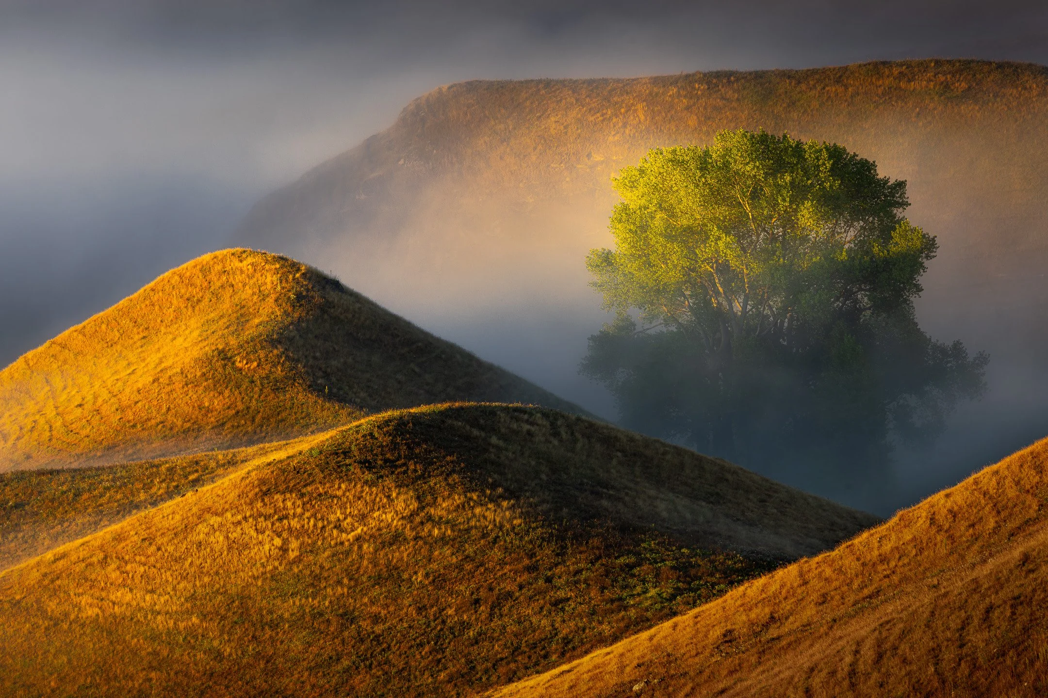
Emerging from the veil of fog, the sunlit tree provides an immediate anchor in the landscape. Its bright green canopy catches your attention first, giving the eye a place to rest before it wanders across the warm, rolling contours of the surrounding hills.
Choosing a focus point isn't really a technical decision. It's closer to answering the question from the last section, what am I responding to, and then making sure the frame agrees with you.
Balance & Visual Weight: Finding Stability in a Scene
Balance gets mistaken for symmetry more often than it should. What it's really about is weight, how much visual pull different parts of the frame have, and whether that pull feels settled or lopsided once you look at the whole. A small dark shape can hold its own against a much larger pale one. A single strong form can outweigh a cluttered background twice its size.
Structured scenes often carry their own balance already, a row of trees evenly spaced, a reflection mirroring itself in still water. You're mostly just recognising it and not getting in its way. Atmospheric scenes ask more of you. A lone tree in mist might only be balanced by the softness of the fog around it, nothing solid on the other side of the frame at all, and that kind of balance is felt more than it's measured. Restraint tends to matter more here than placement.
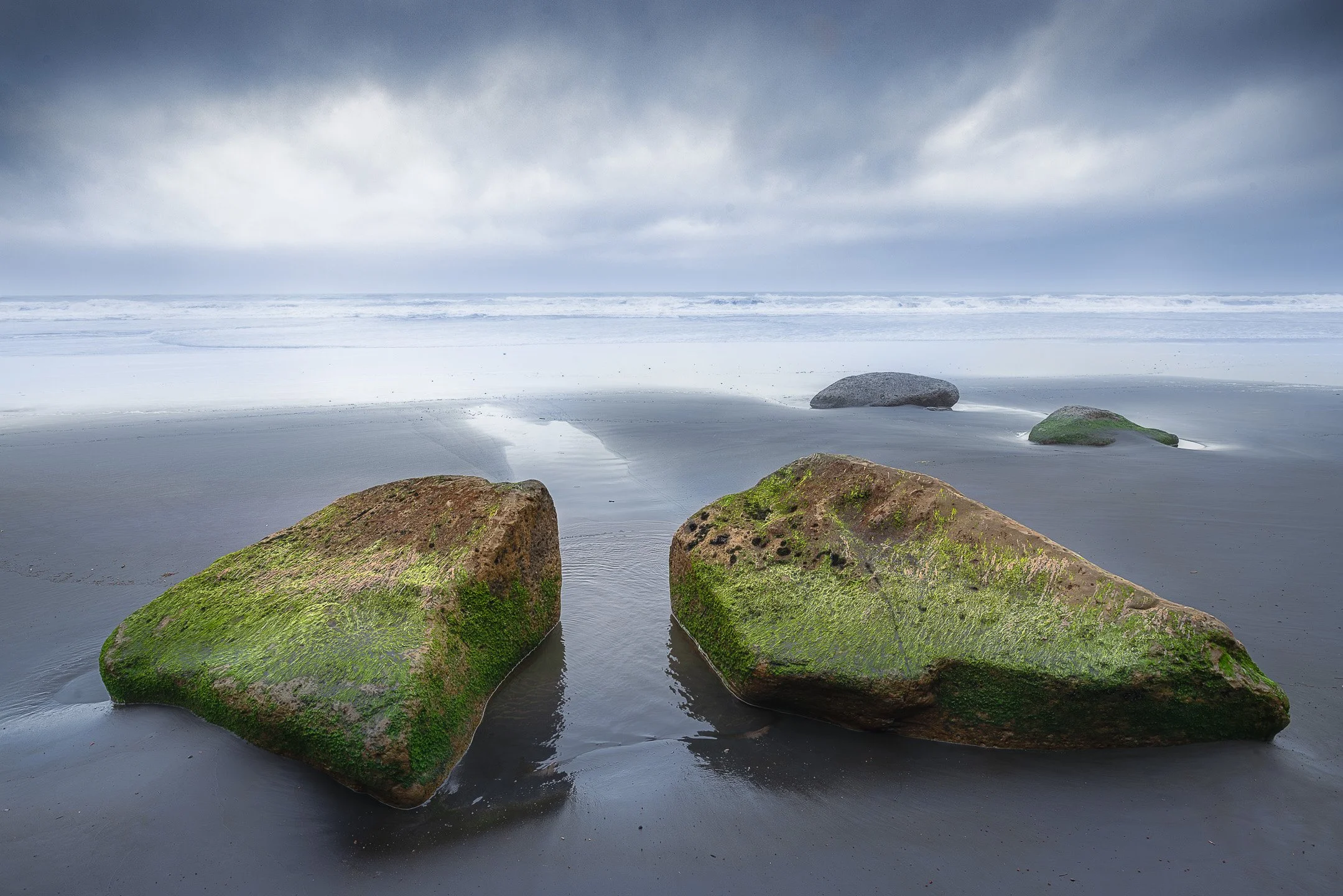
Two mossy boulders sit side by side as equal visual anchors across the lower frame. Their shared weight keeps the foreground grounded, while the open space between them lets the composition breathe.
Point of View: Choosing Where to Stand
Everything discussed so far assumes the camera is already in position, but where you physically stand changes a composition before any of these other decisions even apply. Getting low, close to the tussock or the water's edge, tends to exaggerate foreground and give a sense of scale most people never bother to capture, since most of us naturally shoot from standing height. Getting higher, or moving further back, can flatten a scene and emphasise pattern over depth.
The camera's position isn't a neutral starting point, it's already a compositional decision, made before you've thought about thirds or balance at all.
Before settling into the first spot that seems obvious, it's worth deliberately trying at least one other height or distance, if only to see what the "obvious" position was hiding.
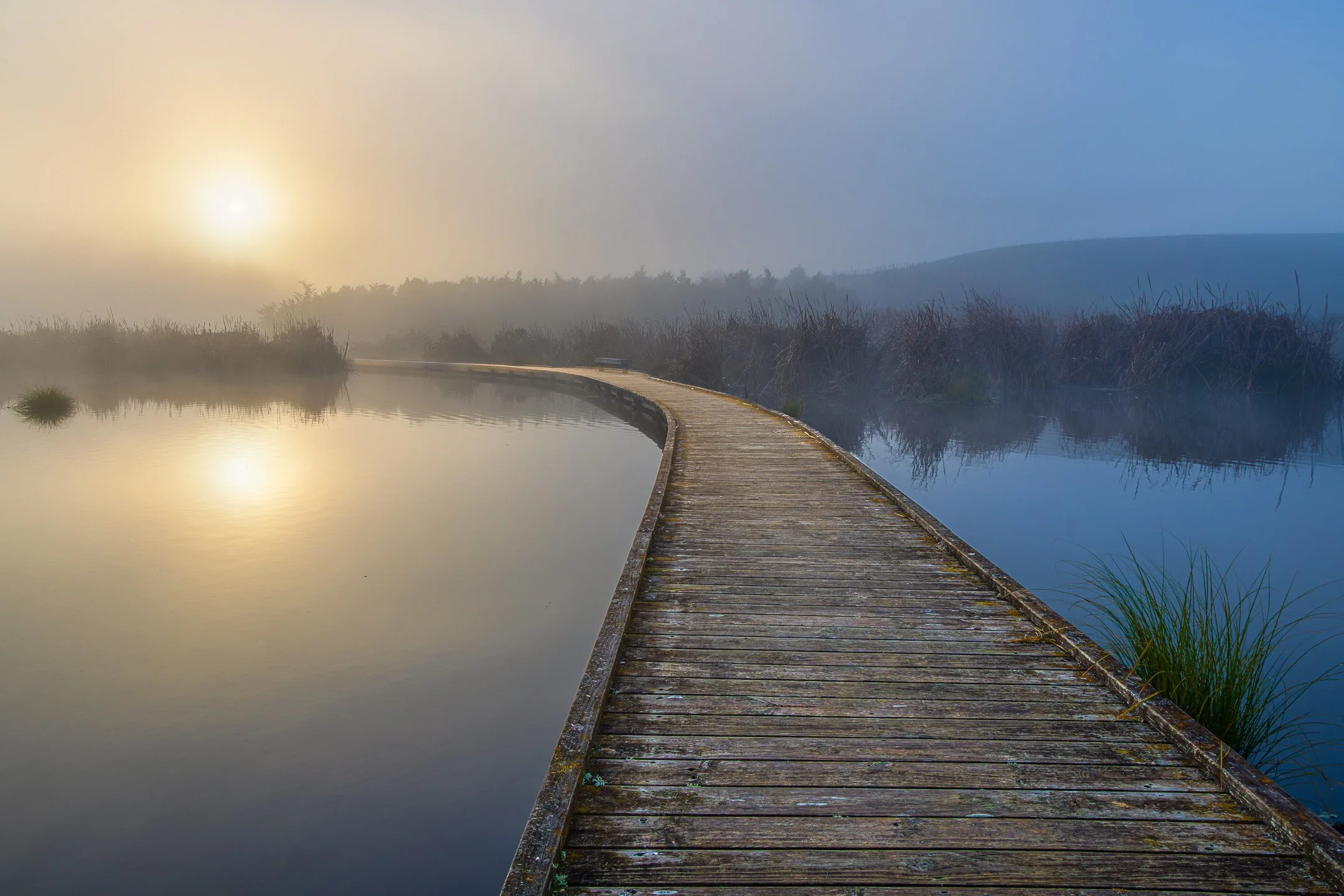
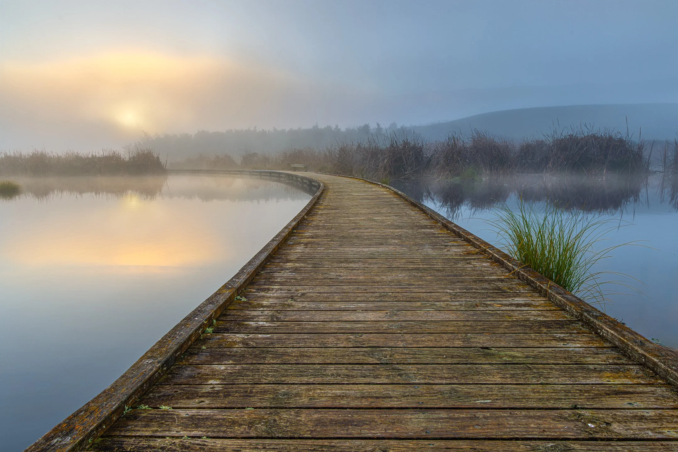
Dropping the camera low to the boardwalk timber exaggerates the foreground, making the weathered wood grain a tangible entry point that draws you straight into the fog. Raising the camera to standing height opens up the water to the left, flattening the path slightly while giving the sun's reflection and the misty wetland equal room to settle.
Framing Orientation and Aspect Ratio: Shaping the Border
Turning the camera from horizontal to vertical is one of the simplest decisions you can make, yet it alters the entire weight of a scene before you touch a setting. A vertical frame squeezes the sides and forces height and depth into focus. It gives a foreground tussock or a nearby rock ledge a direct line to the sky, pulling the eye straight through the middle of the frame. Horizontal framing does the opposite, allowing a scene to spread wide while emphasising stacking ridges and quiet sea horizons.
Beyond orientation, aspect ratio changes how much room your subject has to settle. A tight four-by-five frame feels grounded, which works well when you want to isolate a single form in mist. A wider sixteen-by-nine crop strips away empty sky or mud in the foreground, forcing the eye to sweep across a wide horizon instead. Even a square crop brings its own kind of calm, removing the bias between height and width so that a central subject sits fully anchored.
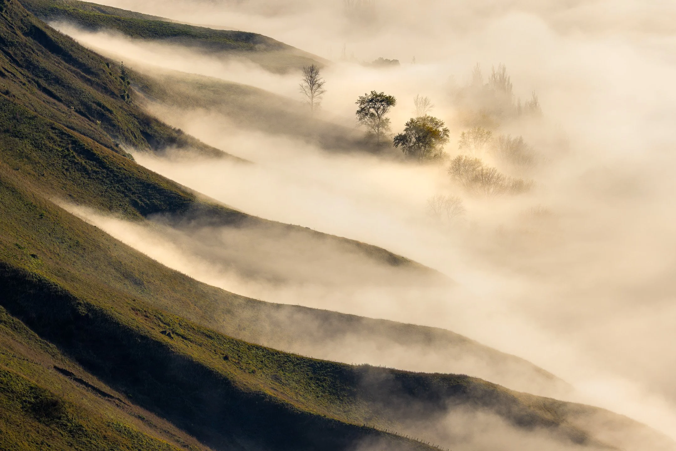
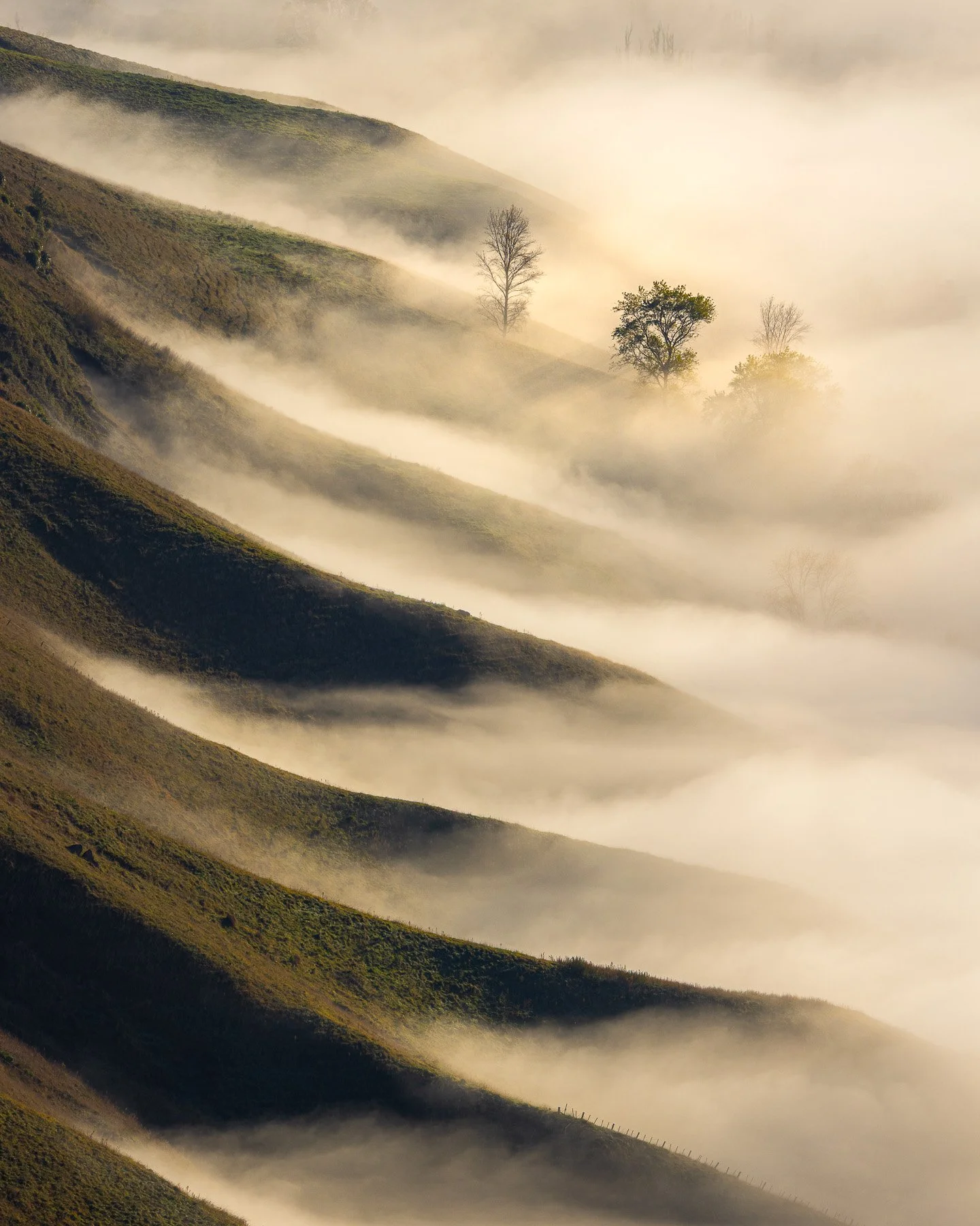
The horizontal frame lets the ridges spread wide, showing the full breadth of fog across the valley. The vertical crop narrows that down, stacking each shadowed slope on top of the next so the eye climbs straight through the mist instead of drifting across it.
Guiding the Eye
Placement gets an image started, but most landscapes have more than one point of interest, and something has to carry the viewer between them. This section is about the paths and shapes that do that work: lines that lead somewhere, triangles that hold their ground, and the occasional bit of friction that keeps an image from feeling too settled.
Leading Lines: Creating the Path to the Anchor
A leading line is any path the eye can follow: a river, a ridge, a fence, a trail, sometimes nothing more solid than a shift in tone. Its job is to take the viewer somewhere on purpose, from the edge of the frame towards whatever you've chosen as the anchor.
In a landscape with strong geometry already, lines tend to announce themselves, a ridge running to a peak, a path cutting through a field, and following them is mostly a matter of noticing where they lead and making sure that's somewhere worth arriving. In softer, foggier scenes, a line might only be implied, a shadowed riverbank, the edge of a ridge half-lost in mist, and it does its work more gently, letting the eye drift rather than march.
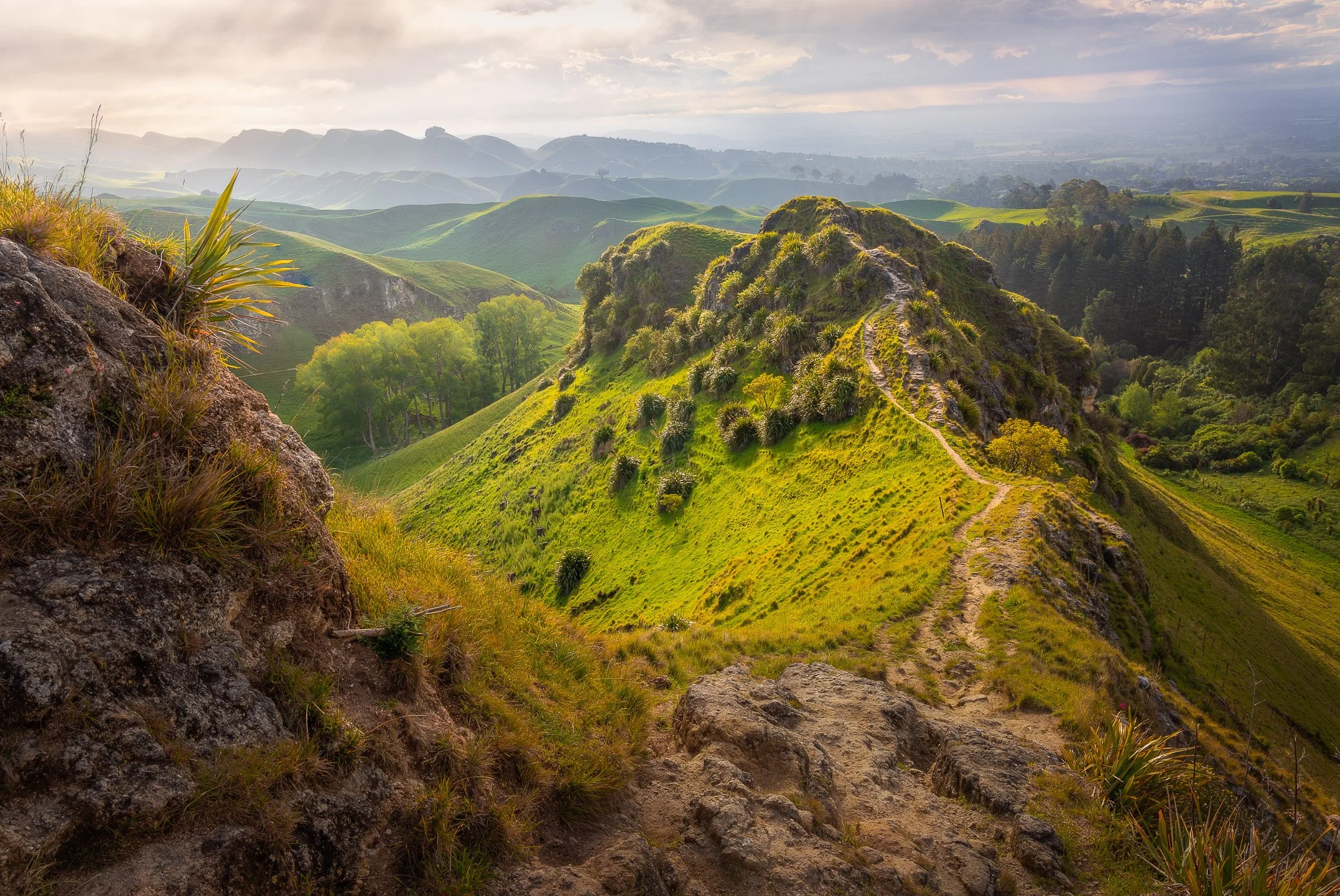
The narrow dirt track winding along the ridge provides an inviting path through the frame. Entering near the lower right, the trail guides the eye smoothly up the crest of the hill, leading you directly towards the sunlit outcrop and the softly layered hills beyond.
Curved Lines: A Gentle Cadence
Straight diagonals carry a strong energy, cutting straight across a frame towards the subject. Curved lines behave differently, inviting the eye to move at a slower, more observant pace. A meandering riverbed or a sheep track sweeping around a hillside gives the viewer time to explore the space around the path before they arrive at the main focus point.
These soft curves, often called S-curves, help anchor a chaotic foreground by offering a smooth transition into the midground.
Where a rigid straight line can feel deliberate and forced, a natural curve feels found. It works quietly with the shape of the land, guiding the eye through the frame without rushing it to the destination.
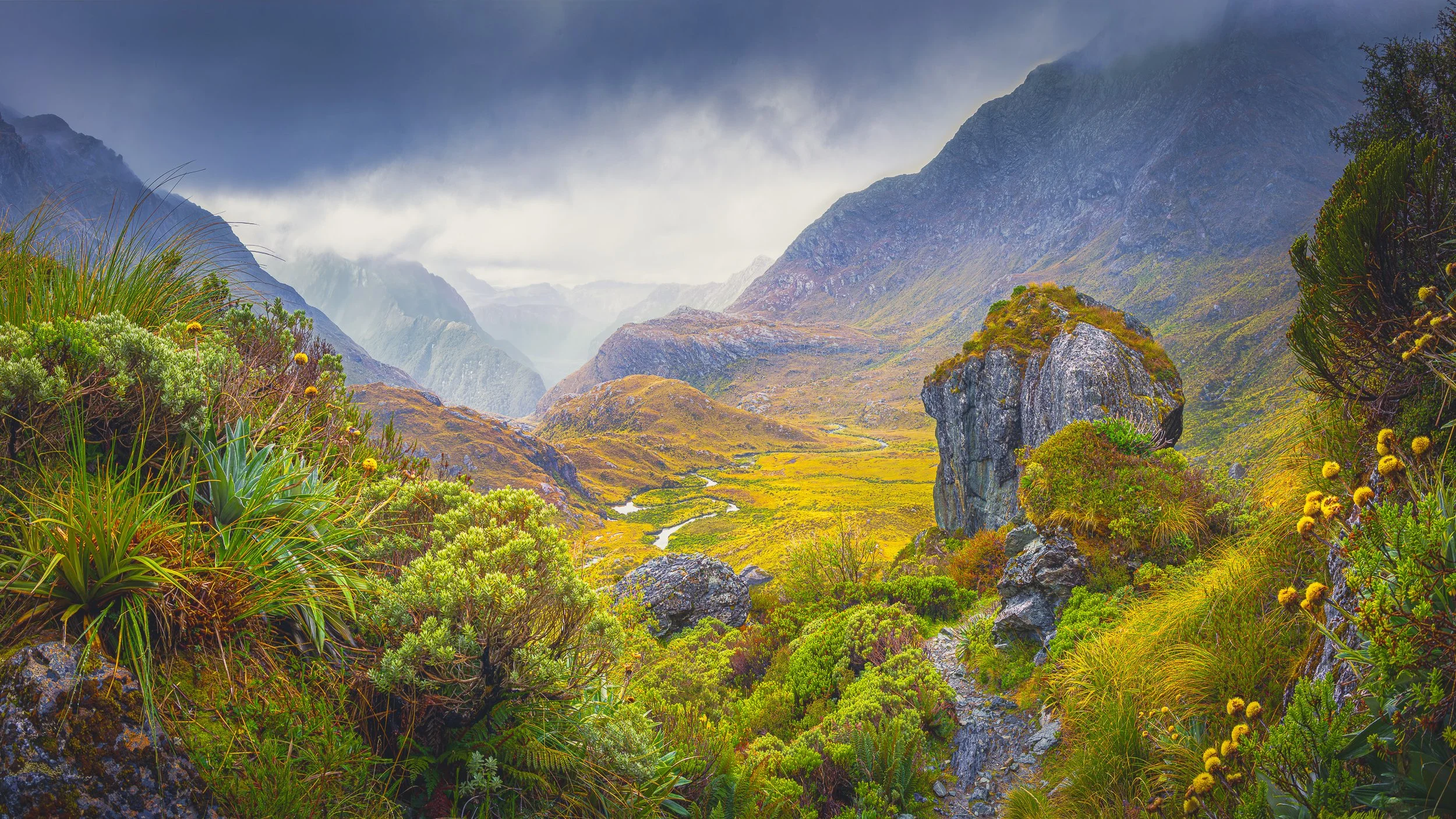
The bright stream winding through the golden valley floor creates a subtle and natural S-curve across the landscape. By sweeping gently back and forth through the basin, the water guides the eye at an unhurried pace, drawing you smoothly past the foreground rocks towards the mist-wrapped peaks in the distance.
Diagonals & Triangles: Using Strong and Dynamic Shapes
Where a line moves the eye, a triangle stops it. Diagonals bring movement into a frame, ridgelines, shadows, converging paths, while triangles, formed by peaks, tree groupings, or the meeting of light and shadow, give the image somewhere stable to land. Used together, they can carry a viewer through a scene and still give them a place to rest.
In more structured scenes, these shapes tend to be obvious, a diagonal ridge running to a summit, a cluster of trees forming a clear triangular mass. In quieter, atmospheric ones, the same shapes might only be suggested, a faint triangle of trunks half-hidden in mist, a diagonal streak of light falling across fog, and their strength comes as much from what's implied as what's actually visible.
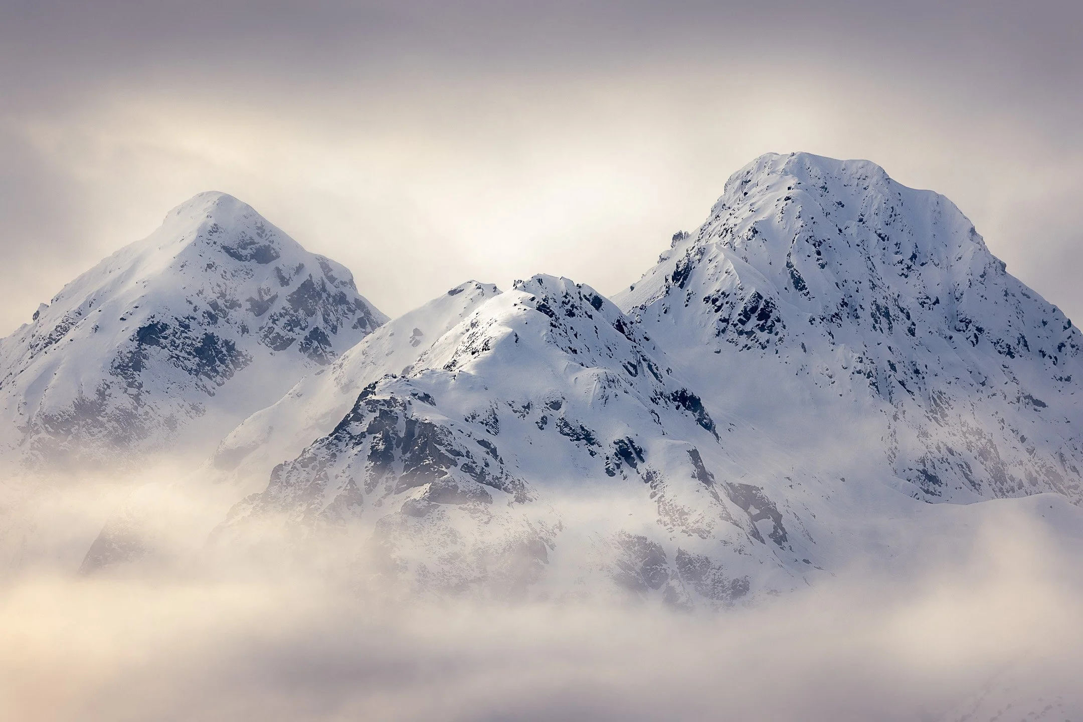
Rising out of the low cloud, these three snow-dusted peaks form a cluster of strong triangular shapes. Their broad bases anchor the scene with a quiet sense of stability, guiding the eye upwards from the soft mist to each distinct summit.
Tension: Energising the Scene
Not every good image needs to feel settled. Tension is what happens when something in the frame pulls against balance instead of towards it. A single tree breaking an otherwise even row, a reflection that doesn't quite match what it's reflecting, a dark shape crowding one side of an open sky.
In structured landscapes, tension usually shows up as a break in a pattern, the one thing that doesn't repeat like everything around it. In atmospheric ones, it's felt more than seen, a shape leaning into fog, a patch of light interrupting what would otherwise be calm. Either way, it's not something to avoid. Used deliberately, it's what keeps a well-balanced image from feeling flat.
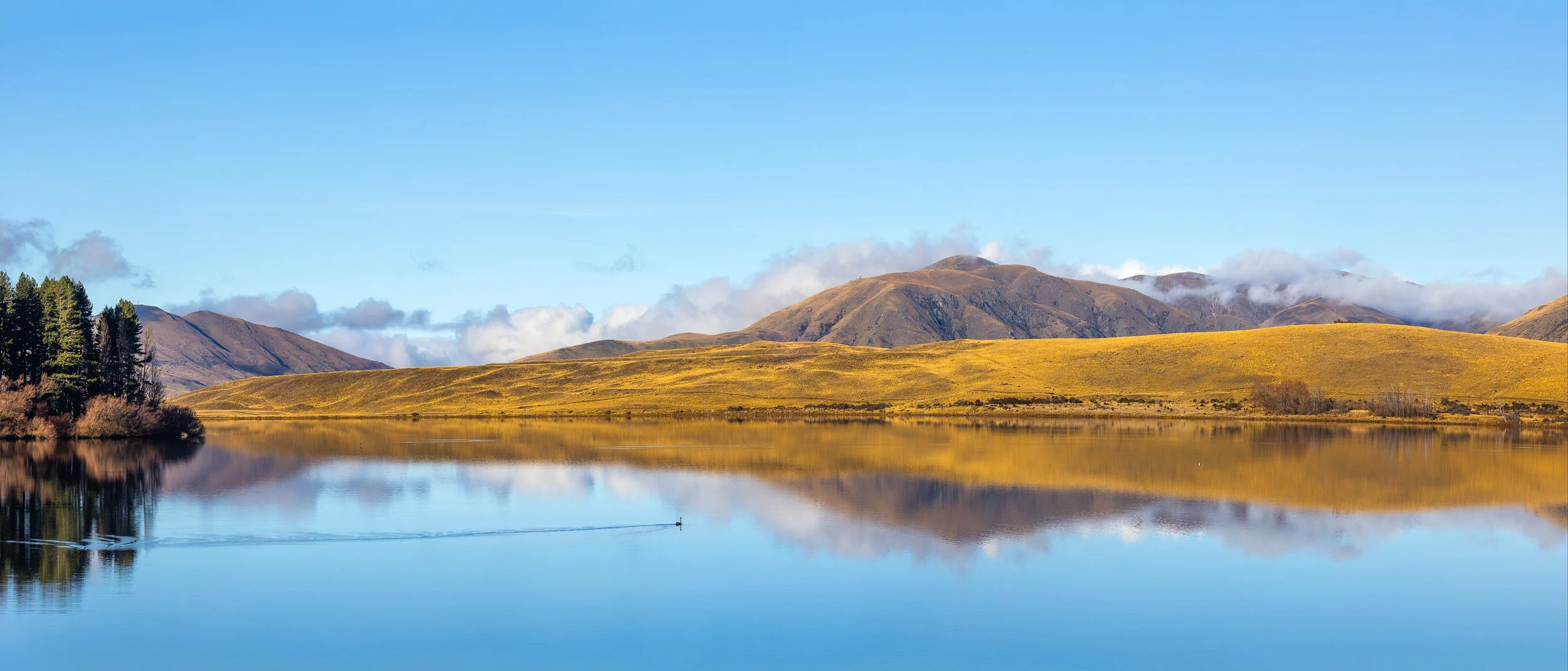
At first glance, the eye takes in the vast, glassy symmetry of the lake and the golden hills beyond. It is only as you look closer that the small dark bird reveals itself, its fine wake rippling across the reflection to introduce a subtle point of tension that disrupts the stillness.
Working with Depth and Space
So far this guide has been about arranging what's already flat on the page, the frame's surface. But a landscape isn't flat, and a photograph can hint at that even though it technically is. This section is about creating a sense of space someone could step into, and about deciding what belongs at the very edges of that space, and what doesn't.
Layers: Creating Depth and Presence
A photograph only has two dimensions, but you can still make it feel like it has three. Thinking in terms of foreground, midground, and background, rather than just "the scene," is how that happens. A row of plants close to the lens, a ridge behind it, a peak further back still, each one becomes a layer the eye passes through on its way into the image.
In more structured landscapes, these layers tend to be obvious and physical, distinct ridgelines stacking towards a peak. In foggy or atmospheric ones, layers are often only suggested, a tree in the foreground, a ridge just barely visible through the mist behind it, and the depth comes from restraint as much as anything, letting the atmosphere do the separating for you.
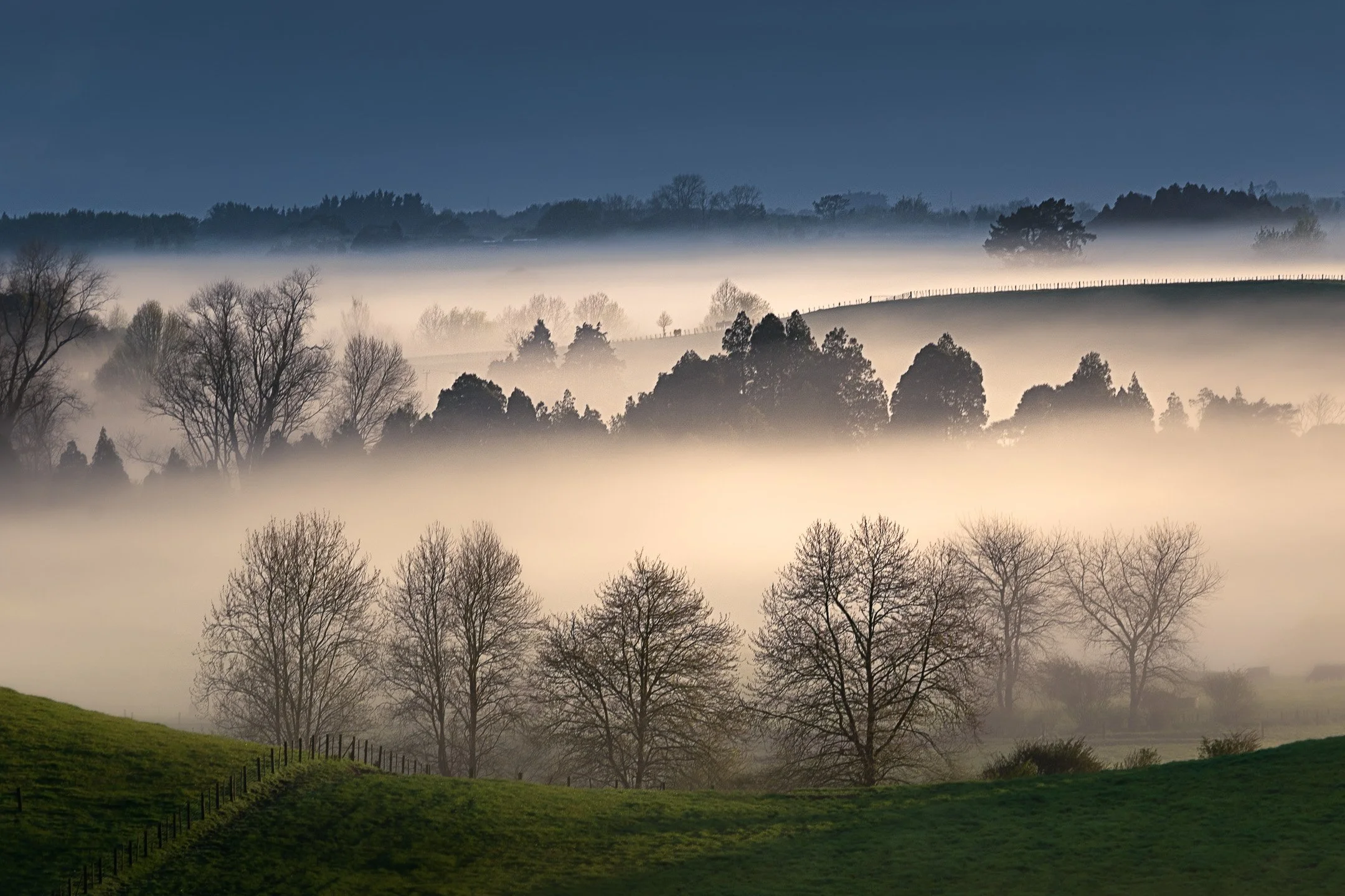
Bands of morning mist divide the land into distinct horizontal planes, creating a clear sense of depth across the frame. The green foreground slope gives way to veiled winter trees, silhouetted evergreens, and a distant ridge, showing how atmosphere can step the eye gently through each layer of the landscape.
Scale: Giving Size Something to Measure Against
A mountain photographed on its own can be difficult to read. Without something familiar nearby, a person, a hut, a solitary tree, there's often nothing in the frame to tell the eye how big anything is. Including one small, recognisable element can transform a scene from simply large to genuinely overwhelming, since the viewer suddenly has something to measure it against.
Scale works because it borrows something the viewer already understands, the size of a person or a building, and uses that as a ruler for everything else in the frame.
It's a small addition, often just one figure in an otherwise empty landscape, but it tends to do more for a sense of grandeur than almost any other single choice.
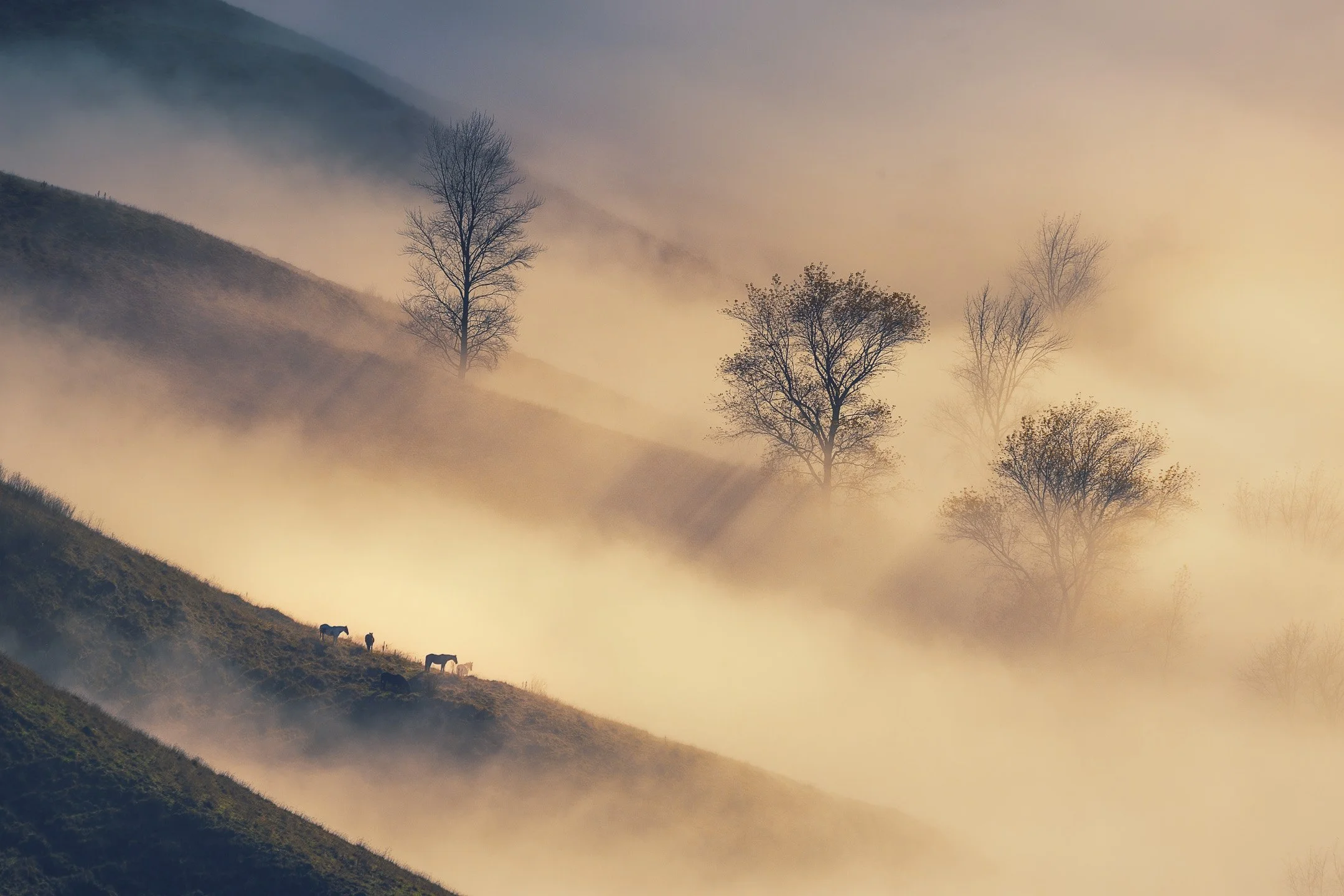
The horses grazing on the lower ridge give the eye an immediate sense of measure. Their small silhouettes instantly reveal the true height of the trees above and the vast, fog-filled depth of the valley.
Natural Framing: Using the Foreground to Create a Window
Sometimes the most useful thing in a frame is something you look through rather than at. Branches, an archway of trunks, the gap in a ridge, all of these can hold a subject the way a window holds a view, giving the eye a boundary that feels found rather than imposed.
In structured scenes, a natural frame usually has a clear physical edge: an arch of branches, a gap between rock outcrops. In softer, atmospheric ones, the frame might just be a darker shape at the edge of the mist, holding the lighter scene beyond it without ever being sharply defined.
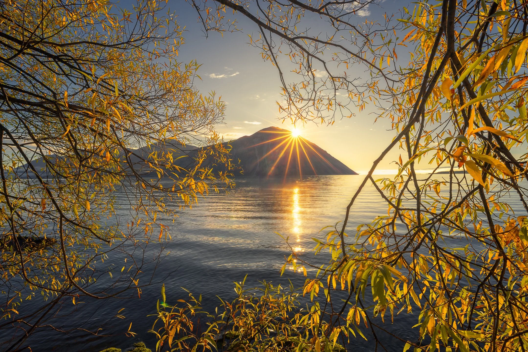
The arching autumn branches create an organic window around the lake. By quietly closing off the edges of the frame, the leaves hold your focus inside the scene, drawing the eye directly towards the peak and the sunburst resting on its summit.
Negative Space & Breathing Room: Isolating the Subject
Not everything in a frame needs to be filled. Emptiness, a stretch of open sky, a calm water surface, an expanse of fog, gives a subject room to be looked at without competing for attention. It's less about what you leave out and more about giving what remains somewhere to breathe.
In structured landscapes, negative space tends to isolate a form clearly, a single tree against an open field. In atmospheric ones, it often arrives on its own, fog or haze doing the emptying for you, and the challenge shifts from creating space to knowing when you have enough of it and should stop adding more.
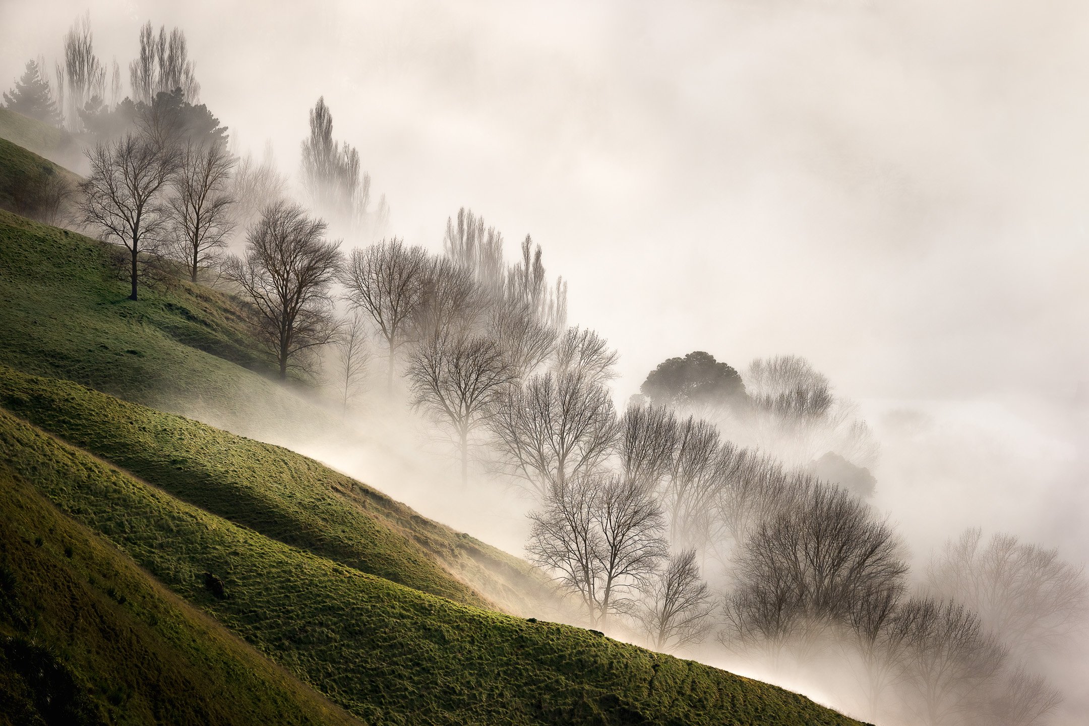
An expanse of fog swallows the valley beyond, filling the upper frame with generous negative space. By stripping away background distraction, the atmosphere gives the bare winter trees and the green slope room to breathe, letting their quiet shapes hold your attention without competition.
Edge Awareness: Controlling the Borders of the Frame
The strongest subject in the world can lose its impact if something distracting is creeping in at the corner of the frame. Before pressing the shutter, it's worth a deliberate look at all four edges, not just the centre, since that's where the eye tends to wander once it's finished with the subject.
In structured scenes, this is often straightforward: a stray branch or fence line at the border can usually just be cropped or repositioned. In atmospheric ones, edges tend to fade rather than intrude, but it's still worth checking that nothing at the periphery is pulling focus away from the calm you've built in the centre.
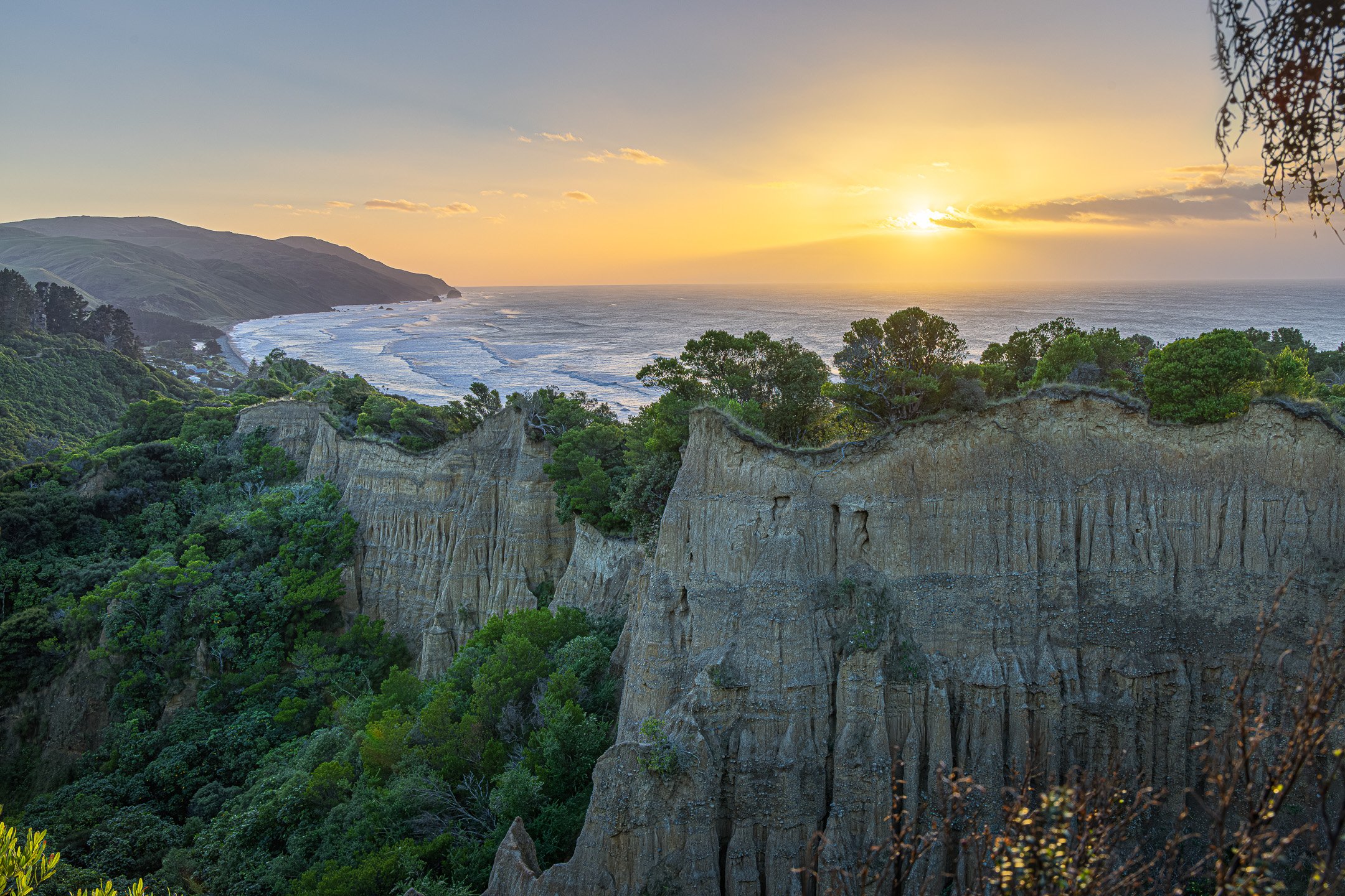
Dark foliage creeping into the top and bottom right corners shows why checking your frame borders matters before pressing the shutter. While the carved clay cliffs and warm coastal light anchor the scene, those dark peripheral branches pull visual attention away from the ocean, demonstrating how easily stray elements along the edges can distract from an otherwise expansive landscape.
There is a fine line between a deliberate natural frame and a corner distraction. A true natural frame creates an intentional window around your subject, wrapping around the scene to hold your gaze inside the image. An edge distraction merely clips a corner or creeps along a margin without building a coherent shape, pulling your eye away from the main scene. When you check your borders before pressing the shutter, ask whether that overhanging foliage is holding your gaze within the landscape or pulling your attention out of it.
Reading the Scene
Most of what this guide has covered comes down to deciding where things go. This section shifts slightly, towards reading what the landscape is already doing before you decide anything at all: the rhythm already present in its textures, the way light is shaping it in a particular moment, and how atmosphere can quietly rearrange all of it without you touching a thing.
Texture & Pattern: Revealing Order Through Repetition
Repetition has a way of organising a scene on its own, before you've made a single compositional decision. Rows of trees, ripples across sand, the branching of a hillside, all of it creates a rhythm the eye can follow, almost without effort. Your job is less about creating that order and more about noticing it, and then framing so it stays legible rather than becoming visual noise.
A pattern gets more interesting the moment something breaks it, one tree standing slightly apart from the row, a single ripple running against the grain. In structured landscapes, that repetition is usually plain to see. In foggy or atmospheric ones, it turns up softer, faint tree trunks fading into the distance, tonal shifts rather than hard edges, but it's still there if you look for it.
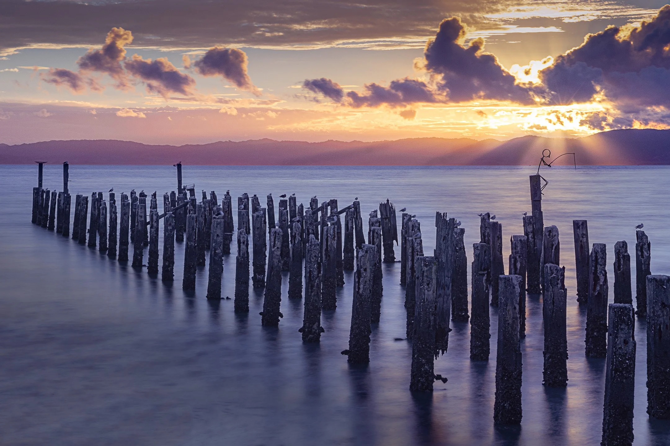
The dense, repeating grid of weathered wharf pilings establishes a strong, rhythmic pattern across the silky water. That cadence is broken on the right, where a tiny stick-figure fisherman perched atop a single post interrupts the repetitive shape and gives the eye an unexpected point of focus.
Composition and Light: Shaping Attention
Everything in this guide so far has assumed the landscape mostly holds still while you work out how to frame it. Light doesn't. It's the one element that's genuinely changing while you stand there, and it's arguably doing more compositional work than anything you choose to include or leave out.
Paying attention to where the light is, and where it's about to be, is often the difference between a scene that's merely there and one that's ready.
In clearer, more structured scenes, light tends to reveal geometry, catching a ridge, throwing a shadow across a repeating pattern, making structure easier to see than it would be in flat, even conditions. In mist or fog, light behaves differently again, softer, more diffused, less about revealing lines and more about mood. A single shaft breaking through the haze is often enough to anchor an entire image.
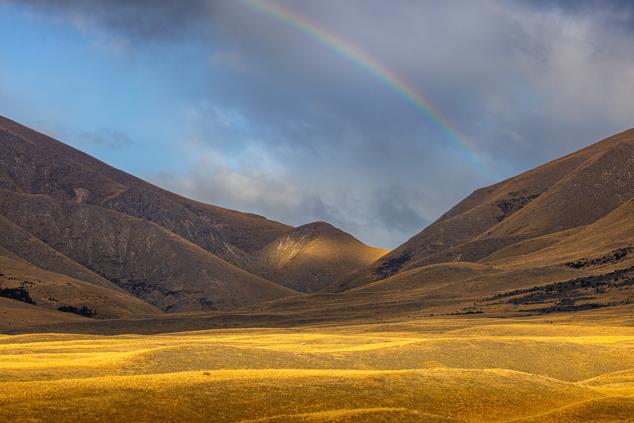
A single break in the storm clouds casts a warm spotlight across the golden tussock and onto the central peak. By leaving the surrounding mountain flanks in deep shade, the light acts as a natural pointer, guiding your eye directly through the dark saddle while the rainbow overhead completes the frame.
Composition and Atmosphere: Reorganising Space
Atmosphere gets talked about mostly as moody, misty, ethereal, or calm. But before it does anything emotional, it does something more practical: it changes the actual space you're working with. Fog softens edges. Haze compresses distance. Rain and cloud shift what has contrast and what doesn't.
That means atmosphere isn't just a backdrop, it's actively reshaping the composition itself, sometimes doing your simplifying for you before you've made a single choice. A cluttered hillside that would need careful framing on a clear day might arrange itself into something clean and minimal the moment the fog rolls in. Recognising when atmosphere is doing that work is often more useful than trying to compose against it.
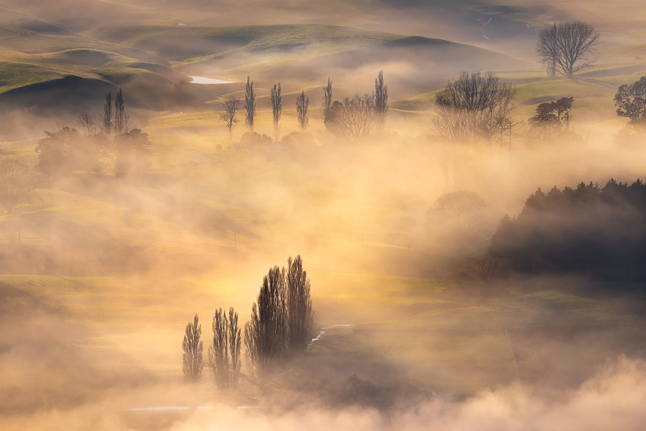
Golden morning mist completely reorganises the physical space of the valley floor. By masking minor terrain details and farm clutter, the fog simplifies a busy rural landscape into distinct, glowing layers, letting the silhouetted stands of poplars float gracefully through the frame and creating a clear, atmospheric hierarchy of depth.
Tonal Contrast: Where the Eye Lands First
Colour grabs attention easily, but raw tone usually commands it first. The human eye is drawn almost instantly to the area of highest contrast in an image, whether that is a bright patch of morning sun hitting a wet boulder or a single dark trunk standing against a wall of pale fog. You can arrange your lines and subject neatly on a grid, but if a bright, overcast patch of sky sits glowing in the top corner, your viewer will look there first.
Using tonal weight deliberately allows you to balance a scene without needing symmetry. A small spot of brilliant light on a distant peak can hold its own against a massive, shadow-filled ridge in the foreground. Before you press the shutter, squint at your frame or switch your camera display to black and white for a moment. Strip away the colour, and check whether the brightest and darkest shapes are helping your subject or quietly fighting against it.
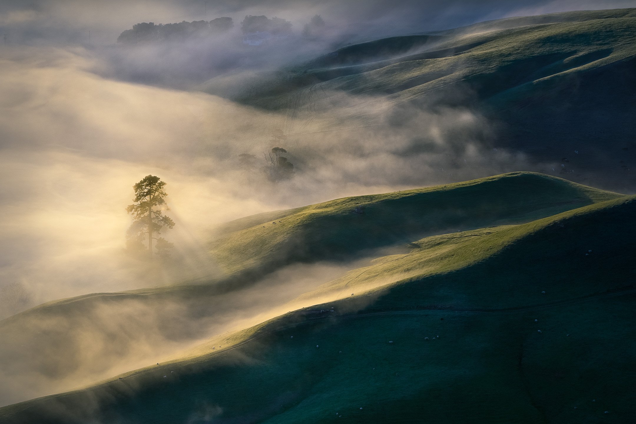
The human eye is naturally drawn to the point of highest tonal contrast. Here, the dark silhouette of the pine tree standing directly against the glowing, backlit mist creates an instant visual anchor, claiming your attention first before the eye strays out across the darker, rolling contours of the valley.
Colour: Guiding Attention and Mood
Colour does a lot of quiet work in a landscape photograph. Warm tones tend to pull the eye and feel close; cool tones recede and feel distant. Beyond that pull, colour can separate depth, a warm foreground against a cool, hazy background reads as space almost automatically, without needing anything else to suggest it.
In structured scenes, colour often reinforces what's already there, a line of autumn trees, a splash of one colour against a neutral field, sharpening a pattern that geometry alone had already started. In misty or atmospheric scenes, colour tends to soften instead, a hint of warmth in the fog, a cool cast across a shaded valley, doing more to set a mood than to define a shape.
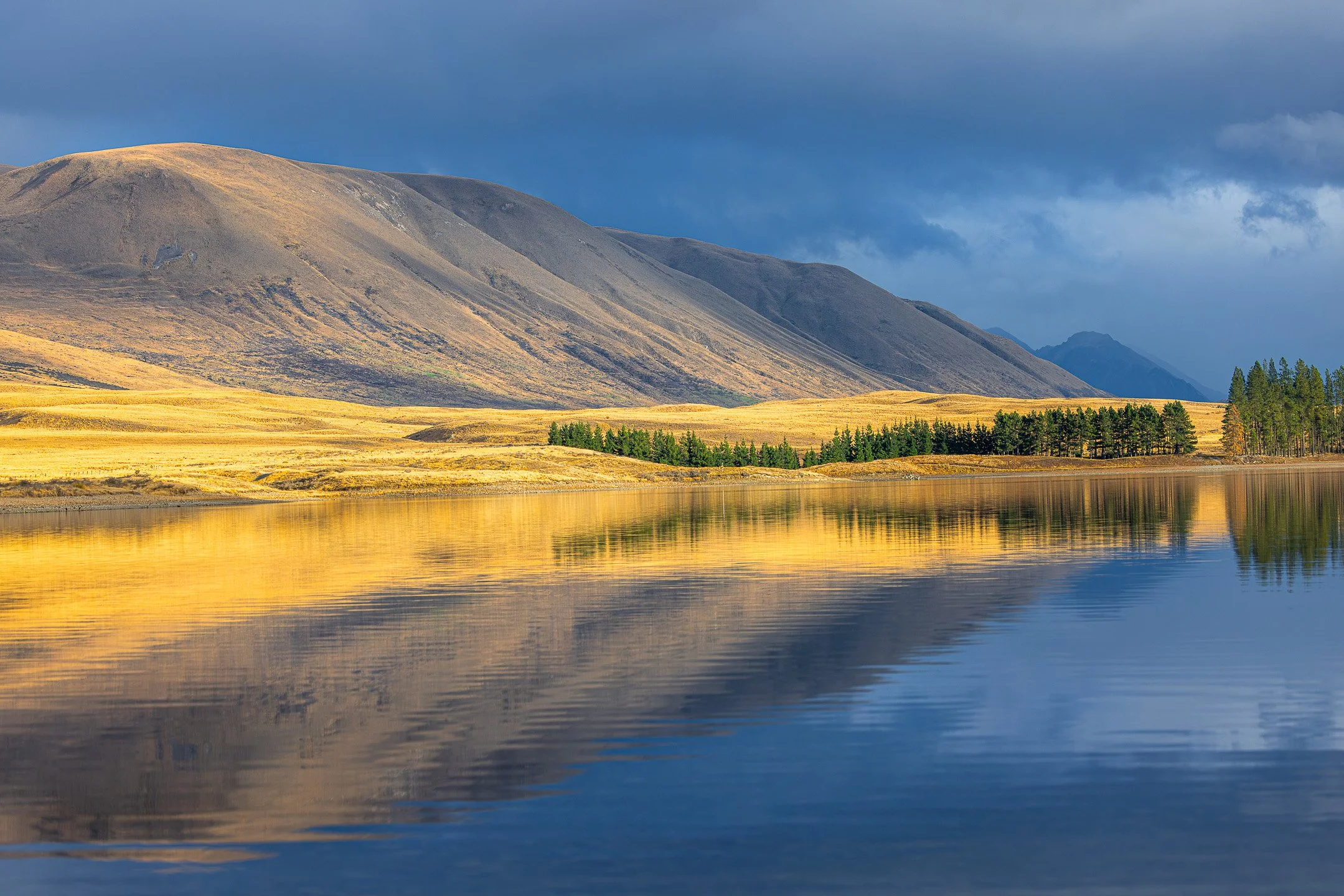
The strong contrast between warm golden light and cool, moody blues demonstrates how colour dictates both attention and emotion. The vivid yellow tussock pulls the eye immediately through the centre of the frame, while the heavy, indigo sky creates a dramatic backdrop that shapes the quiet atmosphere of the scene.
Finishing the Image
Everything so far has been about seeing: what to notice, where to place it, how to guide an eye through it. This last chapter is about what comes after. Some choices happen in the field: aperture, shutter speed, focal length. One happens later, once the file is sitting still on a screen. None of these are technical afterthoughts sitting outside composition. Each one is where the decision you already made either holds up, or doesn't.
Aperture: What Stays Sharp
Aperture is a decision about how much of the scene gets to be sharp. Landscape work leans one way by default, most of what you've seen throughout this guide, the stacked ridgelines in Layers, the repeating wharf pilings in Texture & Pattern, the full sweep of grass and ridge in the very first image, holds sharp front to back. That's not an accident. A narrower aperture is usually what delivers a structured scene's pattern legibly, since a shallow depth of field would blur the very repetition the frame was built around.
The opposite choice, a wide aperture, isolating one element and letting everything else fall away, comes up less often in landscape work, but it's worth knowing when to reach for it. It's the same logic used constantly in nature and detail photography: give the wide aperture to whatever the frame is actually about, and let the rest go soft around it.

A wide aperture isolates the unfurling fern head, letting the forest behind it dissolve into soft, unreadable colour. Where most of this guide holds a scene sharp from front to back, here the opposite choice does the same job every other technique has been doing throughout, deciding what the frame is about, and letting everything else recede.
Shutter Speed: Deciding What Time Does to the Scene
Where aperture decides what's sharp, shutter speed decides what movement is allowed to do to the frame. A fast shutter freezes motion exactly as it was in that instant, a wave mid-break, grass caught mid-sway. A slow one lets time smear that same movement into something calmer and simpler than it was, water turning to silk, drifting fog turning to a soft, directionless haze.
This is where the choice matters most in atmospheric scenes specifically. If fog or mist was already doing the work of simplifying a busy landscape, a slow shutter can extend that same simplification into anything still moving within it, water, cloud, grass, so the whole frame settles into the same quiet register rather than atmosphere doing half the calming and motion undoing the other half. In more structured scenes, a faster shutter usually serves the image better, since the whole point was often a clean, legible pattern, and blurred movement within it would blur the pattern along with it.
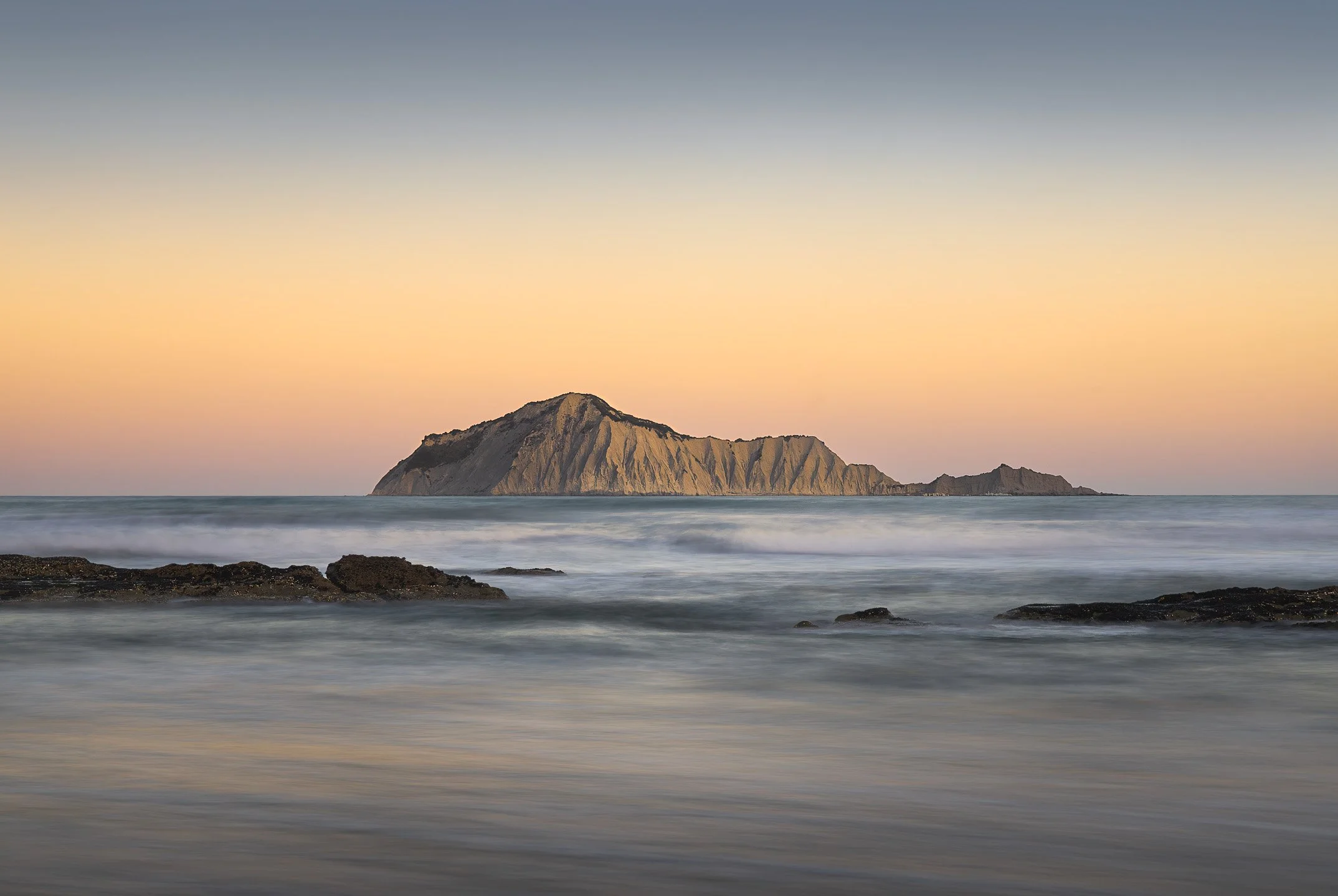
A slow shutter speed smooths the moving surf into quiet, gentle bands of light. By stripping away the distraction of choppy waves, this camera choice simplifies the water, allowing the still, sculpted shape of the island and dark foreground rocks to hold complete priority.
The mechanics of actually dialling in a given depth of field or a deliberately long exposure are covered in my Exposure Triangle guide. What's here is the part that guide doesn't cover.
Focal Length: Deciding How Close Things Feel
Focal length changes the relationship between what's near and what's far, independent of where you're standing. A longer focal length compresses a scene, pulling a distant ridge visually closer to a nearer one, so layers that were genuinely kilometres apart start to feel stacked directly on top of each other. A wider focal length does the opposite, stretching the same layers apart and exaggerating how far the background really is.
This is really the same layering question raised earlier in the guide, just answered with glass instead of with where you choose to stand. A structured scene built on stacked, repeating ridgelines often benefits from that compression. It makes the repetition read as denser and more emphatic. An atmospheric scene relying on a lone shape with real breathing room around it usually wants the opposite: a wider focal length that keeps the space around the subject feeling as open as it was.
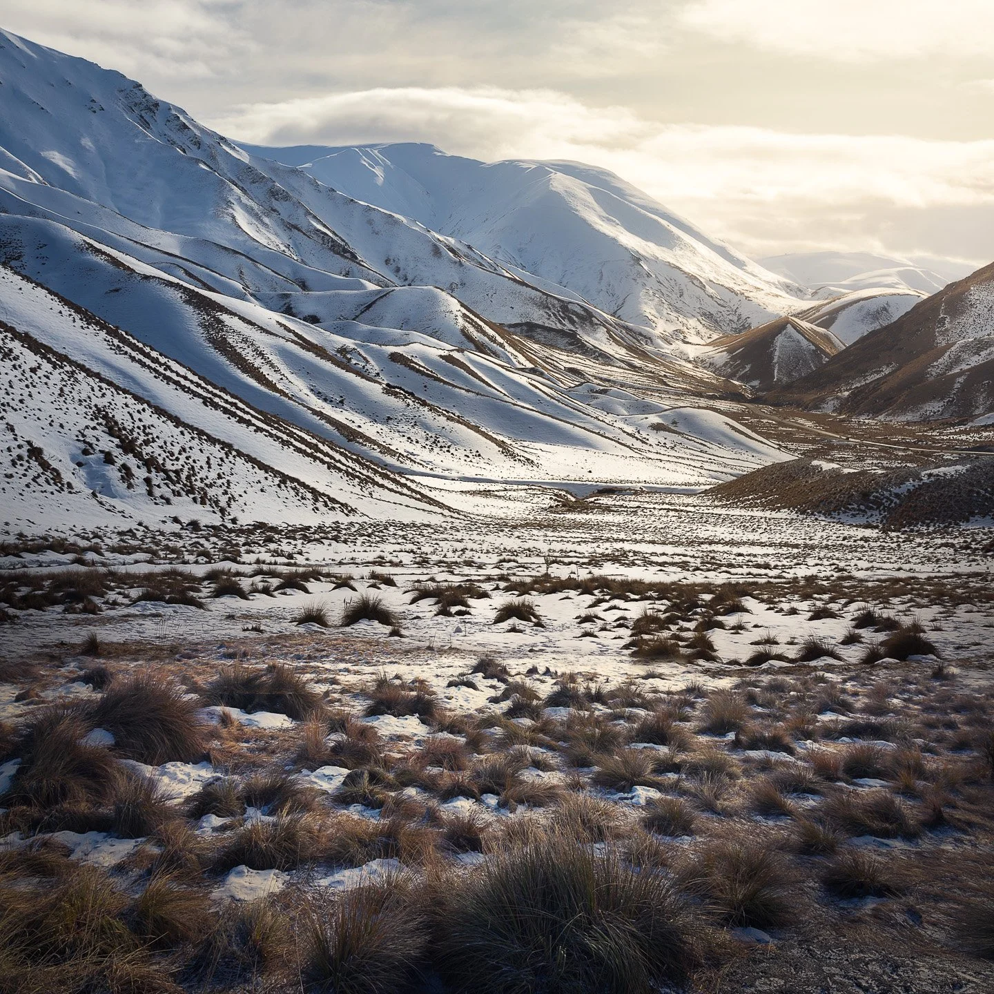
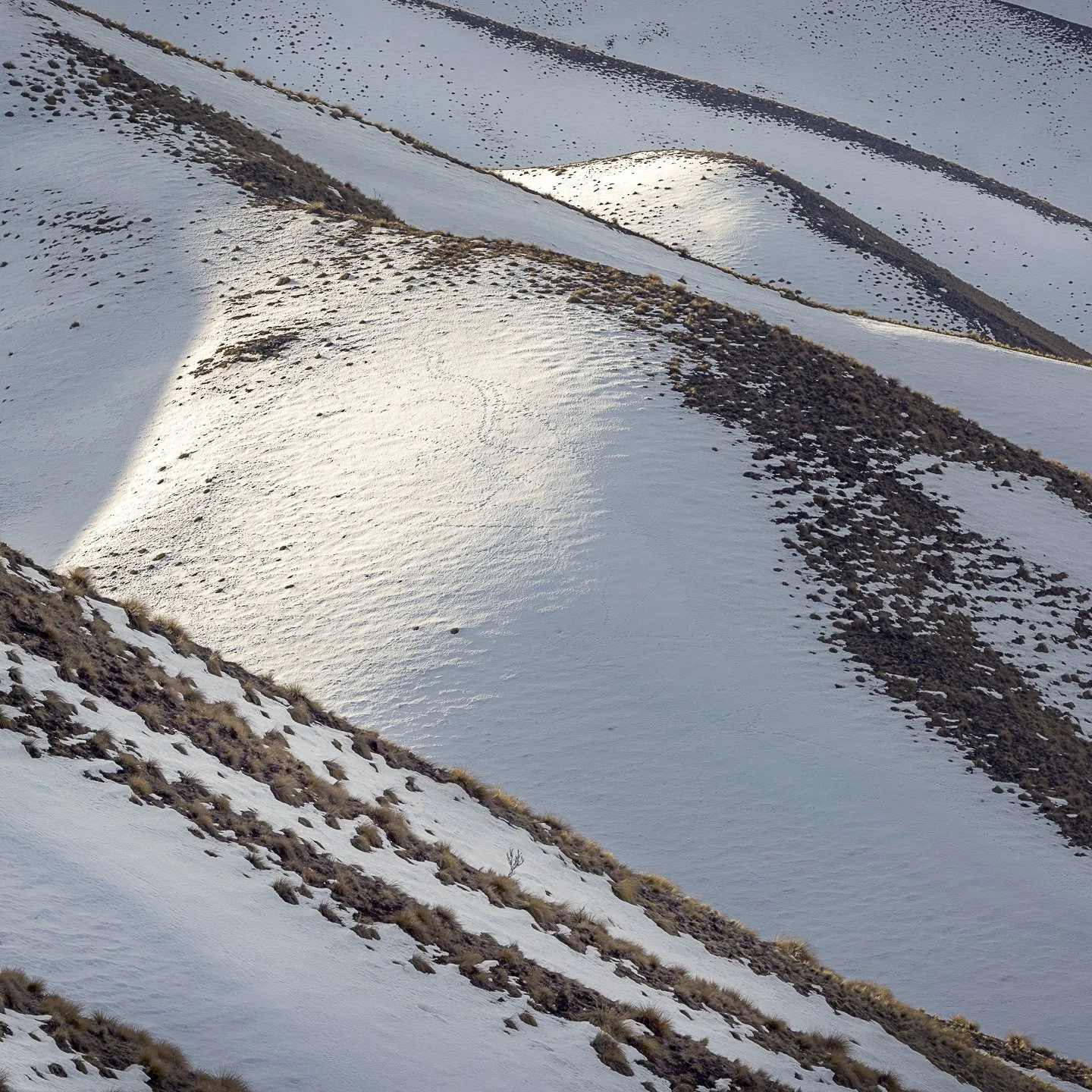
The wide frame holds the whole snow-filled valley, tussock in the foreground giving way to ridge after ridge fading into the light. A longer focal length closes that distance down, pulling one sunlit slope forward until its ridgelines and wind-scoured drifts fill the entire frame, turning what was context in the first image into the whole subject in the second.
Post-Processing: Emphasising the Composition
Everything in this guide so far assumes composition finishes the moment the shutter closes. It doesn't. Cropping, straightening a horizon that drifted while you were focused on the subject, dodging and burning to strengthen a focus point, these are still composition decisions, just made afterwards instead of before.
A crop is the most direct example. If a scene needed a stronger third than you managed in the field, or the framing orientation decision from earlier in this guide turns out to want revisiting once you're looking at the file properly, cropping is simply that decision, made again, with more time to think it through. The same goes for straightening: a horizon that's a degree or two off rarely announces itself in the field the way it does once the image is sitting still on a screen.
Dodging and burning work a little differently. Rather than changing what's in the frame, they adjust how strongly each part of it pulls the eye, brightening a focus point so it holds attention more decisively, deepening a shadow at the edge of the frame so it stops competing with the subject. It's the tonal contrast idea from earlier in this guide, applied after the fact rather than composed for in the moment.
None of this replaces the seeing this guide has spent most of its pages on. A crop can rescue a horizon, but it can't invent a focus point that was never there. What post-processing offers is a second, calmer pass at decisions you already understood, made without wind, changing light, or a narrow window before the moment passes.
Before You Press the Shutter
Everything up to this point has been about deciding what a photograph should do. This last section is just a habit, a final pass before you actually take the shot, to make sure nothing's quietly working against the decisions you've already made.
Go back to the questions from the very start: what were you drawn to, what did you want to show. That's the intent you set back in Observation, and this is the point to hold the frame up against it. Then look at the frame in front of you and ask whether it still delivers on that. Is the horizon level, or has it drifted while you were focused on the subject? Is there anything at the edges, a stray branch, a bright patch of sky, a fence post, pulling attention away from the thing you decided mattered? Is the element you were originally responding to still the clearest thing in the frame, or has something else quietly taken over?
It's worth a moment on the technical side too, checking exposure and confirming what needs to be sharp actually is, since none of the composition matters if the file itself doesn't hold up.
It only takes a few seconds, and it's often the difference between a photograph that says what you meant and one that almost does.
It's also worth saying plainly: almost none of the example images in this guide are doing only one thing. The sunrise ridge that opened the rule of thirds section is also using layers, a diagonal line, and a bright point of tonal contrast, all in the same frame. That's not an exception, it's how most real compositions work. The sections in this guide separate these ideas out one at a time because that's the only way to learn to see any of them clearly, but a finished photograph rarely uses just one. Part of this last pass is noticing which techniques are already stacking in your favour in a scene, and which ones you might still be able to bring in.
Where to Go From Here
Everything in this guide is really just a starting vocabulary, ways of noticing and naming what a landscape is already offering you. Once these ideas start feeling less like a checklist and more like instinct, that's usually the point where technique stops being the interesting part and intent becomes the only thing left to think about.
That's where the rest of my writing picks up. My stories are essays that explore composition alongside expression and perception, less about identifying a triangle or a leading line, and more about what a landscape is asking you to notice about it, and what that noticing can say once you let it. If any of the ideas in this guide stayed with you, that's a good place to keep going.
Want to practise this in the field?
Many of the landscapes featured throughout this guide were photographed right here in Hawke's Bay, where I run small-group photography workshops. The Camera Foundations track for beginners works through these exact ideas hands-on.
Share this article
If you would like more of these visual stories, then scroll to the bottom and subscribe to my newsletter.
Other guides you may find interesting
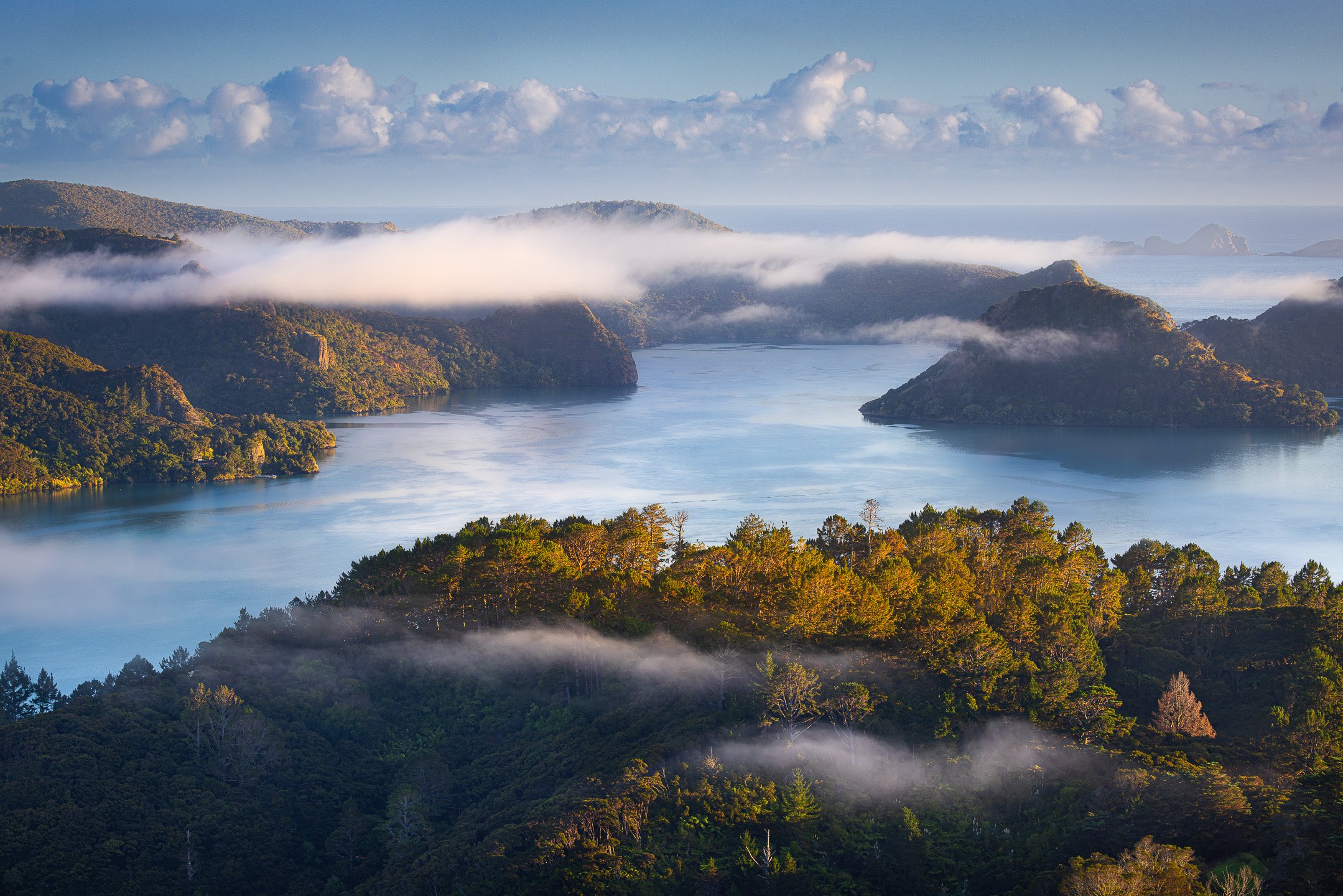
In this composition guide for landscape photographers, I cover composition from first principles through to the judgement calls that come with experience, including the rule of thirds, leading lines, negative space, and more, built around the same questions I ask participants on my Hawke's Bay photography workshops.